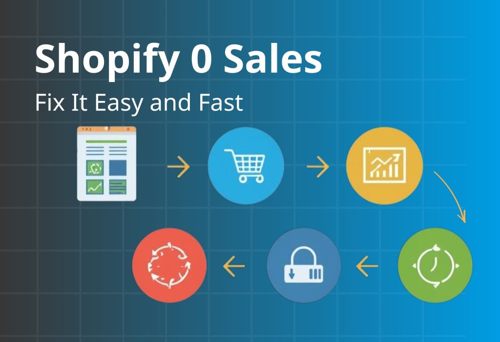
Shopify 0 Sales is frustrating because it feels like traffic should automatically turn into orders—but it doesn’t. The good news: most early “zero sales” stores don’t have a traffic problem. They have a conversion bottleneck in one of three places: Product Page (PDP) → Cart → Checkout. In this guide, you’ll use a Quick Diagnosis Table to find the exact drop-off point, then apply the matching fix plan to turn visits into purchases.
Key Takeaways
If your Shopify store is stuck at 0 Sales, it usually comes down to one (or more) of these root causes:
- Wrong intent: you attract browsers who aren’t ready to buy.
- Weak product page (PDP): value is unclear, proof is missing, or buying feels risky.
- Unexpected extra costs: shipping/taxes appear late and create sticker shock.
- Checkout friction: payment mismatch, too many fields, confusing flow, or errors.
- Low trust: unclear policies, weak credibility signals, or “new store risk.”
Fastest way to fix it: identify where shoppers drop off (PDP → cart → checkout) and fix that leak first.
Shopify 0 Sales: Quick Diagnosis Table
| Symptom | Likely cause | How to confirm | Fast fix |
|---|---|---|---|
| High bounce, low time on page | Intent mismatch / weak first screen | Check top traffic source + landing/PDP first screen | Rewrite headline + match offer to intent |
| Many product views, low Add to Cart | Weak product page (PDP) | Check add-to-cart rate + “buy area” clarity | Improve images, benefits, trust, shipping clarity |
| Good Add to Cart, low checkout start | Cart friction / hidden costs | Check initiate checkout rate + cart behavior | Show shipping earlier + simplify cart |
| High checkout abandonment | Fees, payments, form friction, errors | Check abandoned checkout rate + run a test order | Reduce steps, add payment options, fix UX bugs |
If your store is stuck at 0 sales, don’t “optimize everything.” Use the Quick Diagnosis Table to pick one leak and apply one change that removes uncertainty fast. Start by deciding which stage is failing (PDP vs Cart vs Checkout), then choose the simplest implementation path: proof on the PDP, value framing in cart, or friction removal in checkout.
Quick match:
- High bounce → tighten first-screen promise + verify tracking signals.
- Low Add to Cart → add visual proof (UGC) near the buy area.
- Low checkout start → simplify the offer into a starter bundle or tiered deal.
- High checkout abandonment → shorten the payment path (especially mobile/COD markets).
Explore the Orichi toolkit by goal here: Orichi Shopify Apps.
Find Your Drop-Off Point (Product Page → Cart → Checkout)
If you’re stuck in 0 Sales, your job is to find the single biggest leak in your funnel. You don’t need to guess—you need to locate the drop-off.
Use these questions in order:
- Do people add to cart? If Add to Cart is near zero → the issue is landing/PDP.
- Do people start checkout? If Add to Cart is okay but checkout start is low → the issue is cart clarity/cost/trust.
- Do people reach checkout but not buy? If checkout abandonment is high → the issue is fees, payments, form friction, or errors.
Pro tip: If you aren’t tracking Add to Cart / Initiate Checkout / Purchase reliably, fix that now. Without funnel events, you’ll waste time optimizing the wrong thing.
High bounce usually means visitors didn’t instantly see what they came for. Fixing copy alone isn’t enough if your tracking is messy—because you’ll keep guessing what worked. Do a quick promise audit: write the click reason in one sentence, then rewrite the first screen so the same outcome shows up above the fold (headline + 3 bullets + CTA).
Next, confirm your funnel events are firing cleanly (View → Add to Cart → Checkout → Purchase) and that UTMs reflect the real source/creative. When your store tracks the right events consistently, it becomes easier to diagnose whether bounce is message mismatch or traffic quality.
Implementation shortcut: Orichi TikTok & Facebook Pixels (Multi-Pixel + UTM tracking).
Optional “how it works”: Pixel setup guide.
Module 1: Fix the Product Page (PDP)
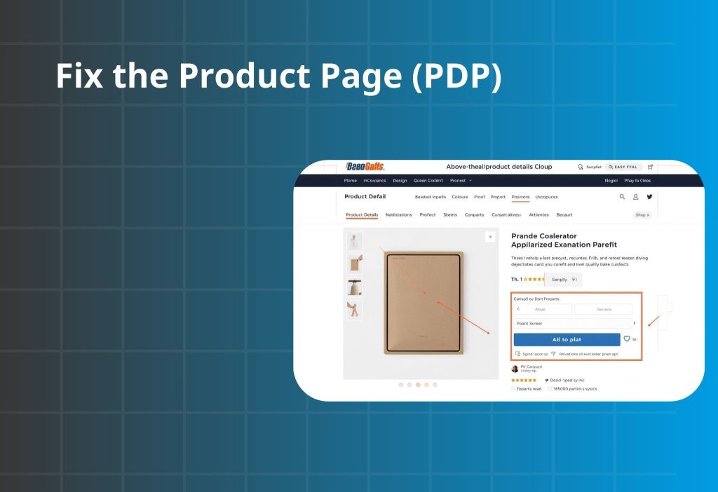
In many cases of 0 Sales, the product page is the first bottleneck. Shoppers don’t buy because they still feel uncertain. This module improves clarity first, then trust, then friction—in the order buyers decide.
Message–Intent Mismatch
People click because your ad, keyword, or influencer post makes a specific promise. If they land on your PDP and don’t immediately see that promise fulfilled, they leave—often within seconds. This is one of the most common early-failure patterns: the store feels busy, but the first screen doesn’t match what people came for.
What to check
| Step | What to do | What you’re looking for | If it’s missing, it means… |
|---|---|---|---|
| 1) Pick one top traffic source | One ad creative OR one keyword OR one influencer post | A single “promise” that drove the click | You’re testing too many messages to diagnose the mismatch |
| 2) Write the click reason in one sentence | “They clicked because they want ___.” | A plain-language expectation | If you can’t say it clearly, your message is likely too broad |
| 3) Do the 5-second first-screen test | View PDP above-the-fold only | The promise is obvious in 5 seconds | Your first screen is unclear or off-angle |
| 4) Problem match | “Does this solve what I clicked for?” | Same promise appears clearly | Message–intent mismatch |
| 5) Trust | “Do I believe this is real?” | Quick proof cue near buy area | Visitors bounce because it feels risky |
| 6) Buying clarity | “Do I know what to do next + what it costs?” | Clear CTA + basic shipping/returns info | Shoppers hesitate because the purchase feels uncertain |
How to fix it
- Mirror the promise in your headline. Use the same language as the ad/keyword (outcome), not just the product name.
- Build the first screen as: Benefit → Proof → CTA. Proof can be one short review line, a UGC snippet, or a compact credibility cue—enough to stop the bounce.
- If traffic is social-heavy, bring social proof onto the PDP. Short UGC/video blocks reduce the “this feels like a random store” effect.
- If you use review platforms, place proof near the buy decision. Don’t bury reviews at the bottom where they don’t prevent bounce.
The offer feels weak
When you have zero sales, “too expensive” is rarely the full story. Most of the time, shoppers don’t see enough value + safety to say yes today. If “what I get / why it’s worth it / what if it doesn’t work” isn’t obvious near the buy area, the price feels risky—especially for a new store.
What to check
| Check | Look at (near the buy area) | A good sign looks like… | If it’s fuzzy, it usually means… |
|---|---|---|---|
| 1) What do I get? | What’s included, quantity, size, variants | Clear in 1–2 lines | People pause because they aren’t sure what they’re paying for |
| 2) Why is it worth this price? | Outcome + differentiator + proof | One clear outcome + one proof cue | Value is unclear, so price feels “too much” |
| 3) What happens if it doesn’t work? | Returns/exchange/warranty/support | Simple risk reducer line | Risk feels high, so they avoid being the first buyer |
How to fix it
- Add a clear “starter choice.” A starter kit, bundle, or volume option reduces decision fatigue and makes value feel easier to justify.
- Make shipping expectations visible early. Even if shipping is calculated later, set expectations near the CTA.
- Frame value in one line (not a long explanation). Example patterns: “Lasts longer,” “Saves time,” “Designed for ___.”
- Reduce selection friction if variants are many. Visual swatches + “most popular” guidance helps buyers decide faster.
PDP images and copy don’t help people imagine using it
Your product page must answer the shopper’s silent question: “Will this work for me?” If they can’t picture it, they won’t buy—no matter how good the product is.
What to check
- Do you have images that show scale, context, and outcome (not just product-only photos)?
- Can a shopper understand usage in under 20 seconds without reading a wall of text?
- Are the most important answers (fit, materials, results, what’s included) visible without deep scrolling?
How to fix it
- Build a visual story with 6–9 images: close-up detail, size/scale, in-context use, what’s in the box, and how-to steps.
- Add short real-life content (UGC/video). This reduces doubt faster than long copy.
- Use a scan-first copy structure: Problem → Solution → Benefits → Quick Q&A → Specs. Keep sections short and obvious.
When people view products but don’t add to cart, it’s rarely because they “need more specs.” It’s because they can’t feel the product working for them. The fastest conversion lift is usually proof placed near the buy button, not buried at the bottom. Add one compact proof block that answers: “Have real people used this?” and “What does it look like in real life?”
A simple structure that works: UGC grid/slider → 1–2 short captions → repeat CTA. Keep it lightweight and mobile-first. If your traffic comes from social, embedding the same style of content on the PDP reduces “new store risk” instantly and improves Add to Cart behavior.
Read more:: Instafeed – Instagram Feeds (Instagram + TikTok UGC on your storefront).
Optional app: Embed Instagram/TikTok proof on your PDP.
Module 2: Fix Cart & Checkout Leaks
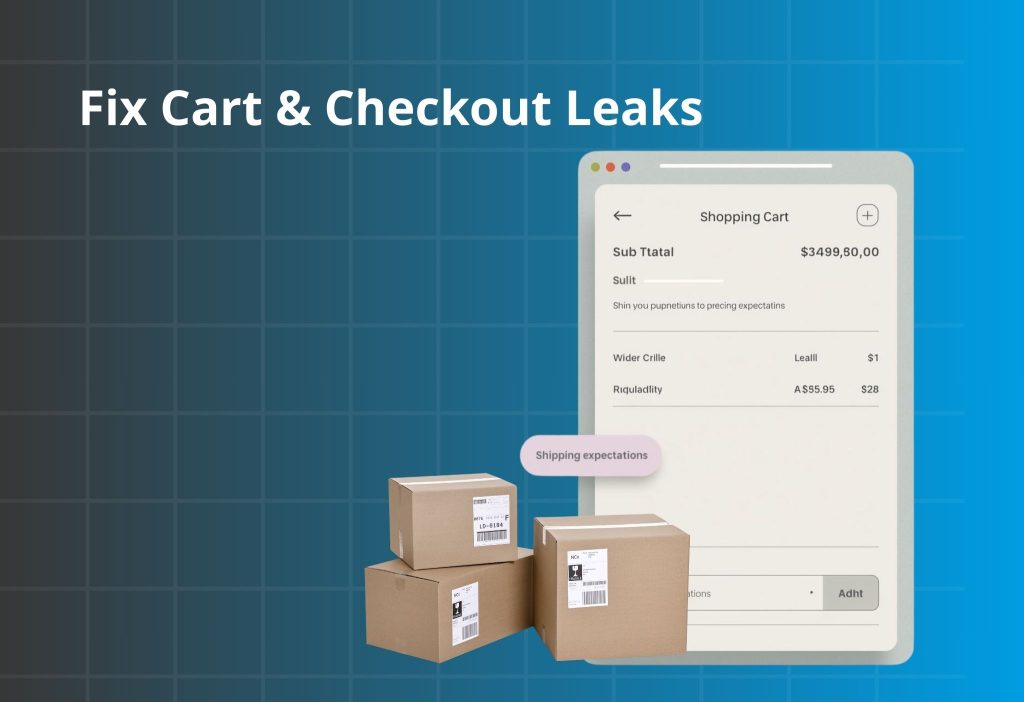
If people add to cart but you still have 0 Sales, friction or surprise costs are usually the culprit. Someone who adds to cart is interested. Losing them after that is often fixable quickly.
Shipping/fees surprise
People add to cart because the product feels right at the listed price. If the total jumps later because shipping, taxes, or fees appear late, trust drops fast—especially on mobile.
What to check
| Where to look | What you’ll see | What it likely means |
|---|---|---|
| Cart → checkout rate | Add to Cart is okay, checkout start is low | Sticker shock or cost uncertainty |
| Checkout step drop | Big drop around shipping/taxes step | Costs appear too late |
| Mobile test order | Shipping/taxes only visible late | “Surprise total” is causing exits |
| PDP buy area | No shipping/returns estimate near CTA | Buyers can’t predict the final cost |
How to fix it
- Set cost expectations early (PDP + cart). Add one short line near CTA and repeat it in cart.
- If you offer free shipping, show the threshold clearly and keep it consistent across pages.
- Clarify totals with labels like “Subtotal (before shipping & taxes)” to avoid “price changed” feelings.
- Localize by region if shipping rules differ.
Checkout friction or errors
High checkout abandonment is usually not “lack of desire.” It’s friction: too many fields, slow steps on mobile, or payment expectations not met. The quickest way to reduce abandonment is to make checkout feel like a straight tunnel: fewer inputs, fewer surprises, and the payment method shoppers trust most in your region.
If your audience prefers Cash on Delivery, forcing a standard multi-step checkout can kill first purchases. A short COD order form can reduce effort dramatically (name / phone / address) while keeping confirmation clear and preventing confusion.
Implementation shortcut: Reduce checkout abandonment with COD.
What to check
| What to check | Where to look | What you’ll notice | What it likely means |
|---|---|---|---|
| Guest checkout | Checkout settings | Account required before payment | Unnecessary friction for first purchase |
| Form length | Checkout on mobile | Too many fields | Drop-off increases on mobile |
| Payment options | Payment step | Missing expected method | Buyers can’t pay the way they want |
| Errors | Test order | Validation errors, slow loading | Technical blockers hiding as “no sales” |
How to fix it
- Allow guest checkout. Offer account creation after purchase if needed.
- Cut fields to essentials. If it doesn’t help delivery or payment, remove it.
- Minimize distractions during checkout. Keep navigation and banners out of the payment flow.
- Validate with a real mobile test order after changes.
Discount code box makes people leave to “hunt coupons”
Discount code fields create a dangerous thought: “I’m supposed to have a code.” That single doubt triggers tab-switching, and tab-switching kills first-time purchases. Instead of pushing more coupons, use built-in value offers shoppers can understand instantly: a starter bundle, a volume deal, or a cart-friendly tiered price.
The goal is to keep momentum—shoppers should feel like the best deal is already visible, not hidden behind a code. If you run promotions, set them as automatic discounts so no typing is required.
Implementation shortcuts: Combo Bundle Discount (bundles / BOGO / mix-and-match) and Quantity Breaks & Order Limits (tiered pricing).
What to check
- Checkout starts happen, but abandonment spikes near payment
- Messages asking for coupons
- Stalls around the discount code area (especially on mobile)
How to fix it
- Use automatic discounts when running promos so no typing is required.
- Avoid highlighting discounts if none are active (don’t create “missing code” anxiety).
- Use value-based offers instead of codes: free shipping threshold, starter bundle, volume deals.
If a field doesn’t help deliver the order or take payment, it shouldn’t be required. The goal is to keep buyers in “finish payment” mode.
Module 3: You’re Getting the Wrong Traffic
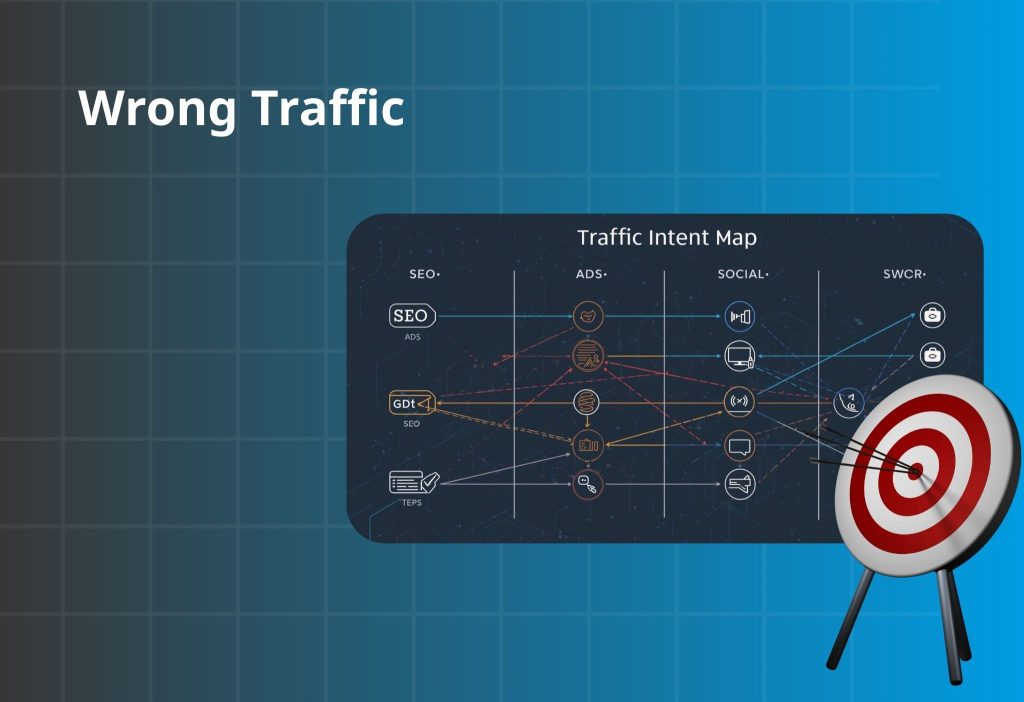
Sometimes 0 Sales isn’t a store issue—it’s a traffic quality issue. Not all sessions are equal. Small, high-intent traffic can outperform large, casual traffic.
If your traffic is mostly SEO
SEO can bring informational visitors who aren’t ready to buy.
Fix fast:
- Map each blog post to a specific product/collection CTA
- Add a short “who it’s for / who it’s not for” qualifier
- Use buyer-intent pages for commercial keywords (comparison, best-for, pricing)
If your traffic is mostly Ads
Ads fail when the promise and landing page don’t line up.
Fix fast:
- Match headline, visuals, and offer between ad and landing
- Split by pain point and send each to a matching landing angle
- Make the first screen answer the click reason in one line
If your traffic is mostly Social / Influencers
Social traffic often has curiosity, but low trust.
Fix fast:
- Put UGC and testimonials near the buy area
- Create a “starter pack” path for first-time buyers
- Make shipping/returns/support visible early to reduce “new store risk”
Wrong traffic doesn’t always mean “bad traffic.” It often means the landing page isn’t built for the channel’s intent. SEO visitors need clarity and a clear commercial path; ad visitors need perfect message mirroring; social visitors need instant trust proof. Use one consistent rule: the first screen must answer the click reason in the same language as the channel.
Then measure your funnel events by source so you stop guessing. When you can see which channel produces Add to Cart vs Checkout vs Purchase, you’ll know whether to adjust the landing promise or refine targeting.
Implementation shortcut for clean attribution and event consistency: Orichi TikTok & Facebook Pixels (Multi-Pixel + UTM tracking).
Shopify 0 Sales 90-minute conversion checklist
If you feel overwhelmed, follow this order. It’s designed to increase conversion first—because scaling traffic on a leaky store burns time and budget.
| Priority | What to do | Impact | Time |
|---|---|---|---|
| 1 | Add shipping/returns line near the buy button | Very high | 15–30 min |
| 2 | Rewrite above-the-fold PDP: headline, benefits, CTA | Very high | 20–40 min |
| 3 | Add one clean proof block (reviews/UGC) near buy area | High | 30–60 min |
| 4 | Reduce checkout friction + enable guest checkout | High | 20–45 min |
| 5 | Replace coupon behavior with auto discount or value offer | Medium–High | 30–60 min |
FAQ
What’s a “good” Shopify conversion rate?
It varies by niche and price point. If you have meaningful traffic and conversion is extremely low, you likely have a clarity/trust/checkout bottleneck worth fixing first.
Does 0 sales mean my product is bad?
Not necessarily. Many stores have good products but weak message match, unclear value, missing trust, or surprise fees.
Should I fix the store or run more ads?
Fix the purchase path first. More traffic won’t help if your funnel is leaking—it will just amplify the leak.
Will discounts solve it?
Discounts can boost short-term conversion, but stronger wins usually come from clear value, predictable costs, and lower perceived risk.
Should I change my theme?
A theme is a container. If your offer and trust are weak, a new theme won’t fix conversion. Fix above-the-fold, shipping clarity, and checkout friction first.
Wrap-up
If you’re dealing with Shopify 0 Sales, focus on where shoppers drop off and fix the matching bottleneck. Start with the fastest wins: make costs predictable, strengthen the first screen of your product page, add trust where decisions happen, and remove checkout friction. When you do those, your conversion rate usually moves—often faster than you expect.
Use the Quick Diagnosis Table above, find your biggest leak (PDP → cart → checkout), and apply the matching fix section today.