Trust And Credibility Issues are one of the most common reasons Shopify stores get traffic but no sales—especially if your brand is new or unknown. Shoppers don’t “read” your store first. They scan for safety signals in the first 3–5 seconds, then decide whether buying feels risky or safe. The good news: trust is measurable and fixable. In this guide, you’ll pinpoint where credibility breaks (home → product page → cart → checkout) and apply a priority fix plan that increases conversions without relying on heavy discounts.

Key Takeaways
Below are the fastest root causes of Trust And Credibility Issues on Shopify—and what to fix first:
- Shoppers can’t tell you’re legit in 5 seconds (no clear brand, contact, policies, proof).
- Risk feels higher than reward on the product page (unclear value, weak proof, missing “what if it doesn’t work?”).
- Surprise costs or confusing totals create instant distrust in cart/checkout.
- Checkout feels unsafe or difficult (missing payment options, forced account, too many steps).
- Your proof is present but misplaced (reviews buried, wrong type of proof at the wrong moment).
Fastest way to fix it: Identify where trust breaks in your funnel (home/collection → PDP → cart → checkout) and fix the P0 trust blockers first—the changes with the biggest conversion impact.
Trust And Credibility Issues: Quick Diagnosis Table
| Symptom | Likely trust cause | How to confirm | Fast fix |
|---|---|---|---|
| High bounce, low time on site | First screen doesn’t look legit | 5-second test + heatmap scroll | Add clear value + proof + policy line above the fold |
| Many product views, low Add to Cart | Value/risk unclear on PDP | Check ATC rate + watch buy-area behavior | Add “what you get + why worth it + what if it fails” near CTA |
| Good ATC, low checkout start | Cart feels risky (fees/policies unclear) | Initiate Checkout rate + cart exits | Show shipping/returns + totals clarity inside cart |
| High checkout abandonment | Payment trust or friction | Abandoned checkout rate + mobile test order | Enable guest checkout, reduce fields, add payment options |
| Lots of “Is this legit?” messages | Missing credibility signals | Support inbox patterns | Add contact proof, about/founder, real-world proof (UGC/reviews) |
Find Your Trust Break Point (Home → PDP → Cart → Checkout)
If you’re stuck with Trust & Credibility Issues, your job is to find the single biggest credibility leak. Don’t guess. Identify where shoppers stop feeling safe, then fixes become obvious.
- Home/Collection: Do new visitors trust you enough to click into a product?
- PDP: Do visitors trust the product enough to Add to Cart?
- Cart: Do they trust the final cost and policies enough to start checkout?
- Checkout: Do they trust the payment experience enough to complete purchase?
Pro tip: If you run Meta/TikTok ads and your funnel events are messy (or polluted by spam/fake events), a first-party pixel + CAPI setup can make diagnosis much clearer. Orichi’s multi-pixel/CAPI app is positioned for that use case.
Module 1: Fix First-Impression Trust (Home + Collection)
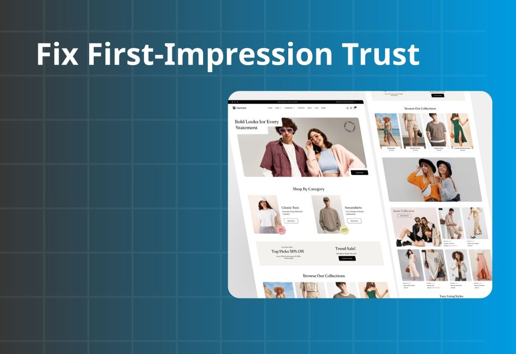
In many cases, trust fails before shoppers even reach your product page. If the store looks anonymous, unclear, or “too salesy,” visitors leave in seconds. This module improves clarity first, then legitimacy signals, then removes “scam vibes.”
“This store feels anonymous”
If shoppers can’t instantly tell who you are, where you ship from, and how you handle problems, your store feels risky—even if your product is good.
What to check
| Step | What to do | What you’re looking for | If it’s missing, it means… |
|---|---|---|---|
| 1) Do the 5-second test | Open Home on mobile, scan only the first screen | Clear promise + what you sell + who it’s for | Visitors can’t anchor trust fast |
| 2) Look for “human proof” | Find About, brand story, photos, team | You feel there are real people behind it | Store feels like a dropship shell |
| 3) Find contact clarity | Check header/footer for email/chat/phone + hours | Easy-to-find support | Shoppers assume no support if issues happen |
| 4) Find policy highlights | Shipping/returns summary visible | A short policy line exists | Risk feels unknown, so they leave |
How to fix it
1. Build the first screen using a simple trust structure: Benefit → Proof → Safety → CTA
- Benefit: clear outcome in plain language
- Proof: one short proof cue (rating line, UGC snippet, “trusted by…”)
- Safety: shipping/returns/support line
- CTA: “Shop best sellers” or “View collection”
2. Add a “legit bar” (one line) under the hero section
This should answer: shipping speed + returns + support in one glance.
Copy/Paste microcopy (choose 1): Legit bar
- “Fast shipping • Easy returns • Support within 24 hours”
- “Secure checkout • Trackable delivery • Hassle-free exchanges”
- “No hidden fees • Clear delivery dates • Responsive support”
3. Add one “human block” (short, not a novel)
A compact section beats a long essay: 1 real photo + 3 lines: why you exist + what you promise + how you support customers.
Copy/Paste microcopy (choose 1): About mini-blurb
- “We built ___ to help ___ achieve ___. Every order is quality-checked before it ships. If it’s not right, returns are simple.”
- “We focus on ___ (quality/safety/fit) so first-time buyers feel confident. Questions? Our team replies fast. Clear returns, no stress.”
- “This isn’t a faceless store. You’ll find real support and clear policies—so you can buy without second-guessing.”
4. Make support feel real and easy to reach.
Put one support line near the top (header/sticky help), not only in the footer.
Copy/Paste microcopy (choose 1): Support proof
- “Need help? Chat with us — we typically reply within a few hours.”
- “Questions about sizing or fit? Our team can help before you buy.”
- “Support: ___ • Typical response time: within 24 hours.”
“Policies are hidden or vague”
Hidden policies don’t protect you. They increase perceived risk and reduce purchases.
What to check
| Check | Where to look | A “good” sign looks like… | If it’s fuzzy, it usually means… |
|---|---|---|---|
| Shipping timeline | Home + PDP + cart | Delivery estimate visible early | Shoppers fear surprise delays |
| Returns/exchange | PDP near CTA | Simple return promise in 1–2 lines | “What if it doesn’t work?” is unanswered |
| Contact path | Header/footer | Support channel is obvious | People assume you’ll disappear after purchase |
How to fix it
1. Don’t bury policy links—summarize them where decisions happen
- PDP near CTA: “Easy exchanges within 7 days”
- Cart: “Subtotal (before shipping/taxes)” + shipping note
Copy/Paste microcopy (choose 1): Returns / exchange line
- “Not the right fit? Returns are easy within 30 days.”
- “Need an exchange? We’ll help you swap it fast.”
- “Item arrived damaged? We’ll make it right — contact support.”
Copy/Paste microcopy (choose 1): Shipping clarity line
- “Estimated delivery: – business days.”
- “Shipping is shown before you pay — no surprises.”
- “Free shipping over $___ (where available).”
2. Write policies like a buyer, not a lawyer
Keep it short, plain, and predictable. Avoid vague lines like “Contact us for details.”
“Design feels risky or spammy”
Even with good products, certain UI patterns trigger distrust.
What to check
- Too many popups, spinning wheels, fake timers, aggressive scarcity (“Only 1 left!”).
- Inconsistent fonts, messy spacing, low-quality images.
- Overuse of badges/icons that clutter the buy area.
How to fix it
- Remove or reduce “pressure” elements and keep the layout clean.
- Keep one primary CTA style, one consistent font system, and generous spacing.
- Replace fake urgency with real safety: shipping clarity, returns promise, support proof.
Copy/Paste microcopy (choose 1)
- “No hidden fees — you’ll see the total before checkout.”
- “Real customer photos and reviews — scroll to see them.”
- “Clear support and clear policies, so you can buy confidently.”
Read more:
Social Proof for Shopify: Build Trust in 5 Seconds
Best 7 Social Proof Apps for Shopify Store
How to Add Trust Badges to Your Shopify Product Pages
Module 2: Fix Product Page Trust (PDP)
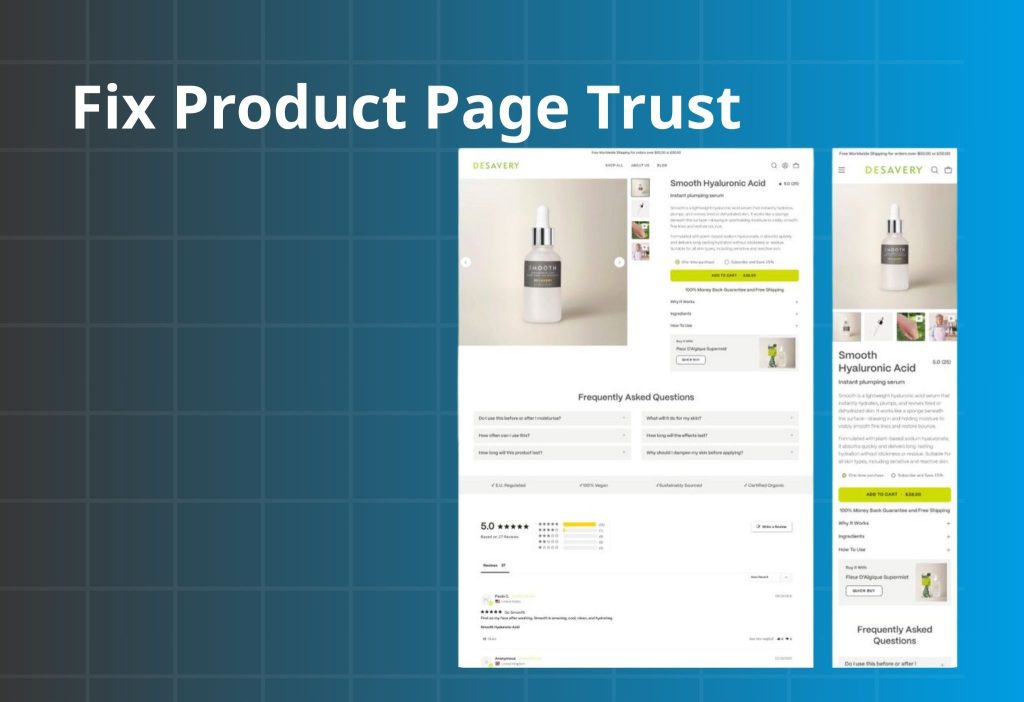
If shoppers reach your product page but don’t add to cart, it’s usually not “price.” It’s uncertainty. Your PDP must answer three silent questions fast: What do I get? Why is it worth it? What happens if it doesn’t work? This module fixes trust in the right order: clarity → proof → friction.
Value feels unclear
What to check
| Check | What to look at (buy area) | A “good” sign looks like… | If it’s fuzzy, it usually means… |
|---|---|---|---|
| What do I get? | Title, variants, what’s included | Clear in 1–2 lines | People can’t justify price |
| Why worth it? | Benefit + differentiator + proof | One outcome + one proof cue | Price feels risky |
| What if it fails? | Returns/exchange/warranty info | A simple risk reducer | No one wants to be the first buyer |
How to fix it
1. Add a “3-line buy box helper” near the CTA.
This is the fastest trust upgrade because it turns doubt into clarity without rewriting your entire page.
Copy/Paste microcopy (choose 1): 3-line buy box helper
- “Designed to help you ___ (outcome) without ___ (common pain).”
“Loved for ___ (quality/comfort/results) — see reviews below.”
“Easy returns within 30 days.” - “Get ___ (main result) in ___ (time/effort).”
“Real customer photos + reviews on this page.”
“Shipping shown before you pay.” - “What’s included: ___ (1-line).”
“Why it’s worth it: ___ (1-line).”
“If it’s not right: easy returns.”
2. Make “what you get” impossible to miss.
Put a one-line “in the box / includes” statement near variants, not buried in descriptions.
Copy/Paste microcopy (choose 1): What you get
- “Includes: 1 × ___ + 1 × ___ (bonus: ___).”
- “You’ll receive: ___ (quantity) + ___ (accessory).”
- “In the box: ___ • ___ • ___.”
3. Frame value in one sentence.
A single crisp line near the price beats a long paragraph.
Copy/Paste microcopy (choose 1): Why it’s worth it
- “Built to last longer than typical options — fewer replacements.”
- “Made for everyday use — comfortable, durable, and easy to maintain.”
- “Designed to solve ___ (pain) so you don’t have to ___ (workaround).”
4. Add one risk reducer next to the CTA.
The buyer should never have to hunt for returns/exchange basics.
Copy/Paste microcopy (choose 1): Risk reducer near CTA
- “Not right for you? Easy returns within 30 days.”
- “Need an exchange? We’ll help you swap it quickly.”
- “Arrived damaged? We’ll make it right — contact support.”
If you want a clean “starter kit / buy more save more / bundle & save” setup without relying on coupon codes, Orichi’s bundle/volume discount app is built for that pattern (bundles, volume discounts, free gifts, etc.)
Social proof isn’t doing its job
Reviews don’t help if they’re buried, generic, or placed far from the decision. Proof must match the shopper’s doubt at that moment.
What to check
| Check | What to look for | A “good” sign looks like… | If it’s missing, it means… |
|---|---|---|---|
| Proof near CTA | Above/near the buy area | 1 short proof cue is visible | Shoppers hesitate because it feels unverified |
| Objection-matching reviews | Review content | Reviews mention fit/quality/shipping/results | Proof exists but doesn’t reduce the main doubt |
| Visual proof (UGC) | Images/video | Real customer photos/videos appear on the page | Page feels “too polished” or stock-like |
| Trust density | Page layout | Proof is present but not cluttered | Too much proof can look spammy |
How to fix it
1. Place one short testimonial line near the CTA.
Choose a line that answers a common objection (quality, delivery, fit, results).
Copy/Paste microcopy (choose 1): 1-line testimonial near CTA
- (Quality) “Better quality than expected — feels premium in hand.”
- (Shipping) “Arrived fast and packaged well. Tracking was accurate.”
- (Fit/Size) “Fit was true to size — and exchanges were easy.”
- (Results) “Noticeable difference within a week — and no irritation.”
2. Use “context-matching proof” where doubt happens.
- Put shipping-related proof near shipping info.
- Put fit/size proof near the size guide.
- Put results proof near “how it works.”
3. Add a small UGC block (even 4 tiles helps).
Real-life photos reduce “is this legit?” better than badges.
Copy/Paste microcopy (choose 1): Proof-first CTA (to lead into UGC/reviews)
- “See real customer photos”
- “Read reviews by topic (quality, shipping, fit)”
- “Watch how it looks in real life”
Photos and copy don’t help shoppers imagine using it
If shoppers can’t picture the product in their life, they won’t buy—especially from a new brand.
What to check
| Check | What to look for | A “good” sign looks like… | If it’s missing, it means… |
|---|---|---|---|
| Visual story | Product gallery | In-use + scale + details | Shoppers can’t “mentally try” the product |
| “How it works” clarity | Page sections | Steps are simple and scannable | Product feels confusing or risky |
| “What’s included” clarity | Near variants/CTA | One-line inclusions statement | Shoppers worry they’ll get the wrong thing |
How to fix it
1. Build a “visual story” with 6–9 images
- Close-up detail
- In-context use
- Size/scale
- What’s included
- How to use (steps)
- UGC/social clip (if possible)
2. Use a scan-friendly copy structure
Problem → Solution → Benefits → Specs → Quick Q&A
Keep sections short. Make it easy to skim.
Copy/Paste microcopy (choose 1)
- “How it works: 1) ___ 2) ___ 3) ___. That’s it.”
- “Best results: use it ___ (frequency) for ___ (time).”
- “Care: ___ (one line). Returns are easy if it’s not right.”
Module 3: Fix Cart And Checkout Trust Leaks

If shoppers add to cart but don’t buy, they’re not “uninterested.” They’re uncertain. Cart and checkout leaks usually come from surprise costs, unclear totals, payment mismatch, or too much friction—especially on mobile. This module removes surprise and keeps momentum.
Shipping/fees surprise
People add to cart at the product price. If the total jumps later (shipping, taxes, fees), trust drops fast. Even when costs are legitimate, revealing them late feels like a bait-and-switch.
What to check
| Where to look | What you’ll see | What it likely means |
|---|---|---|
| Cart → checkout rate | ATC OK, checkout start low | Total feels unpredictable |
| Checkout step drop | Big drop at shipping/taxes step | Sticker shock creates distrust |
| PDP above the fold | No shipping/returns note | Shoppers can’t predict final cost |
| Mobile test order | Costs appear late | People feel “bait-and-switch” |
How to fix it
- Set expectations early: near CTA add delivery estimate + shipping note.
- Clarify totals in cart: “Subtotal (before shipping & taxes)” and “Taxes calculated at checkout.”
- If you offer free shipping, show a clear threshold and progress in cart.
Payment trust + checkout friction
What to check
| Check | Where to look | What you’ll notice | What it likely means |
|---|---|---|---|
| Guest checkout | Settings + checkout | Forced account creation | Too much friction for first purchase |
| Payment options | Checkout payment step | Missing preferred methods | People don’t trust or can’t pay |
| Form length | Mobile checkout | Too many fields | Abandonment rises on mobile |
| Errors/slow load | Test order | Bugs or slow pages | Trust collapses instantly |
How to fix it
- Enable guest checkout and simplify fields
If it doesn’t help deliver the order or take payment, don’t require it. - Add/align payment methods for your audience
Match what buyers expect in your market. Payment mismatch looks like risk. - Make checkout a straight line
Remove distractions and keep checkout focused on completion.
If you still want extra revenue, use post-purchase upsells (after payment) instead of interrupting checkout. Orichi’s post-purchase upsell app is designed for that flow. If you still want extra revenue, use post-purchase upsells (after payment) instead of interrupting checkout. Orichi’s post-purchase upsell app is designed for that flow.
Discount code box triggers coupon hunting
When shoppers see a coupon field, many assume they should have a code. They leave to search—and don’t come back.
What to check
- Checkout abandonment spikes around discount field
- Users stall/stop near the code area (session recordings)
- Customers message: “Do you have a discount code?”
How to fix it
- Use automatic discounts instead of codes whenever possible.
- If you don’t run coupons, don’t visually emphasize the code box or tease discounts.
- Prefer clean offers that don’t require typing: bundles, free shipping threshold, “buy more save more.”
Orichi’s quantity breaks/order limit app supports automatic discount patterns like quantity breaks and tiered pricing—useful if you want discounts without training people to hunt coupons.
Rule: If an element doesn’t increase clarity or reduce risk, it doesn’t belong near the buy path.
Trust is built by simplicity, predictability, and proof—not by pressure tactics.
Module 4: Trust Stack for New Stores (Borrowed credibility → Proof)
If you’re brand new, you need a “trust stack” so buyers don’t feel like the first test subject.
The simple trust stack
- Borrowed credibility: small influencer content, community mentions, real people using it
- Founder/brand story: 3–5 lines + real image, why you exist
- Product proof: UGC/video, before/after if relevant, demonstrations
- Risk reducers: returns/exchanges, shipping clarity, support SLA
- Placement: show proof where doubt happens (not only at the bottom)
90-minute Trust Checklist (P0 → P2)
| Priority | What to do | Impact | Time |
|---|---|---|---|
| P0 | Rewrite above-the-fold: Benefit + proof + shipping/returns line | Very high | 20–40m |
| P0 | Add 1–2 line returns + delivery estimate near CTA | Very high | 10–20m |
| P0 | Add clear support proof (chat/email + response time) | High | 10–20m |
| P1 | Place 1 short testimonial near CTA + add UGC block | High | 30–60m |
| P1 | Clarify cart totals + reduce checkout friction (guest checkout) | High | 20–45m |
| P2 | Add “starter choice” (bundle / best seller) | Med–High | 45–90m |
Orichi’s product feed app focuses on syncing/optimizing feeds for Google Merchant Center and Meta catalog channels, which can improve traffic quality when set up correctly.
FAQ
What’s a “good” trust setup for a new store?
A clear first screen, visible shipping/returns near CTA, real support proof, and at least one form of authentic product proof (UGC or reviews that mention real outcomes).
Do I need a lot of reviews to look credible?
No. A few relevant reviews placed near the buy decision often outperform many generic reviews buried at the bottom.
Will discounts fix trust issues?
Discounts can create short-term movement, but they don’t fix risk. If your policies, proof, and purchase path feel uncertain, discounts often just reduce margin without solving conversion.
Should I change my theme?
A theme won’t fix unclear value or missing proof. Fix trust and clarity first, then improve design polish if needed.
Wrap-up
Trust & Credibility Issues don’t mean your product is bad. They mean the buyer still feels uncertain at a specific step. Start by finding where trust breaks (home/collection → PDP → cart → checkout), then fix the P0 trust blockers first: clearer first screen, visible shipping/returns, real proof, predictable totals, and a frictionless checkout. Do that, and conversion rate usually moves faster than you expect.
![]()