Imagine stepping into an online store where you must read through dropdowns like “Red,” “Blue,” or “Green” to select a variant — and often, the color name doesn’t quite match what you’re picturing. That disconnect can turn browsing into a guessing game.
Enter color swatches — small, visual representations of available color variants. They bridge the gap between expectation and reality, greatly improving the browsing and shopping process.
The Impact of Color Swatches on UX
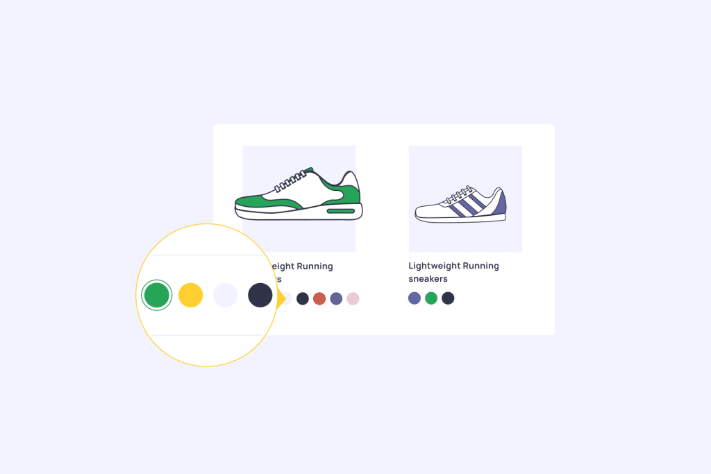
- Quick Visual Recognition — Customers can instantly see the available colors, eliminating guesswork and friction during product selection.
- Faster Variant Discovery — Swatches allow users to preview different options without navigating away from the product page, making exploration seamles
- Lower Returns & Greater Confidence — Seeing accurate visual representations reduces misrepresentation, leading to fewer returns and more confident purchases. A Reddit user noted: “Improved User Experience: Customers no longer have to imagine what a product will look like in another color. · Reduced Return Rates”
- Higher Engagement for Visual Products — For stores featuring apparel, shoes, or décor, swatches make browsing more engaging. Another user commented: “Yes, color swatches work well for shoes and apparel as they boost engagement and help customers browse variants faster.”
How Color Swatches Drive Sales
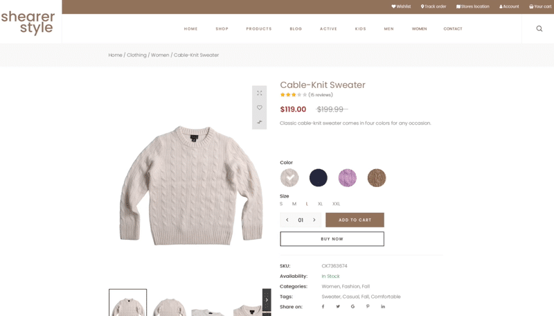
- Elevated Conversion Rates — By streamlining variant selection, swatches reduce friction and lead to more completed purchases.
- Enhanced Average Order Value (AOV) — Use swatches to highlight product features, match accessories, or promote limited edition colors — encouraging users to add more to the cart
- Faster Decision-Making — When shoppers can immediately see color options, they’re more likely to make purchases quickly, reducing cart abandonment.
Practical Implementation on Shopify
- Built-in Theme Support — Many Shopify themes (like Dawn, Prestige, Impulse) now come with native swatch support. Simply enable the feature in your theme customizer.
- Manual Setup via Liquid — For custom implementations, engage a developer to integrate swatches using Shopify’s Liquid templating and CSS.
- App-Based Solutions — No coding required? Use apps like Variant Image Automator or Swatchify available on the Shopify App Store to add and manage swatches with ease.
- Automatic Swatch Generation — Some setups auto-create swatches based on variant color naming or images (e.g., “red.png”), streamlining the process, especially for large catalogs
Best Practices for Effective Color Swatches
- Accuracy is Key — Swatch colors must match the actual product to avoid misrepresentation and returns. Use high-quality, true-to-life swatch images where possible
- Accessible & Clickable — Ensure swatches are sufficiently sized and spaced, especially on mobile. For instance, Baymard recommends a minimum interactive touch area of 7 × 7 mm with 2 mm spacing
- Improve Interaction Feedback — Use hover effects (on desktop) or active state indicators to show selection clearly
- Shade Grouping vs. Individual Swatches — For very similar colors, decide between grouping them as one swatch for simplicity or showing each shade separately for transparency
- Use Actual Textures or Patterns — For complex surfaces (like metallics or textures), use realistic swatches to better communicate appearance
- Avoid Truncation — If many variants are available, keep swatch view scrollable horizontally instead of hidden or truncated — Estee Lauder lipstick offers a smooth example with 46 shades
Conclusion
Color swatches are far more than decorative—they simplify browsing, reduce purchase friction, and align expectations with reality. By improving product clarity and visual confidence, they help store owners boost conversions, reduce returns, and elevate overall UX.
To start reaping these benefits:
- Enable or add swatches via theme customizer or code
- Use apps for hassle-free integration
- Follow best practices in design, accessibility, and interaction
Take the next step: If you’d like help choosing the right theme or app for swatches—or crafting a style guide that blends accessibility with aesthetic—just say the word. Your Shopify store’s visual and sales potential is waiting to be unlocked!
And if you want to make your set up become easily and real quick, we got your back. Try our Swatchify app to make your products look more interesting and interactive!
FAQ
Do color swatches work for all product types?
Color swatches are most effective for products where color is a primary decision factor, such as clothing, home decor, beauty products, and accessories. For products where color is less important, other variant display methods might be more appropriate.
How many colors should I show in swatches?
Research suggests 5-9 color options provide the best balance between choice and decision-making ease. If you have more colors, consider grouping similar shades or using expandable sections.
Can I use color swatches with Shopify’s free themes?
Many of Shopify’s free themes now include built-in support for color swatches. Check your theme’s documentation or settings panel, or consider upgrading to a theme that includes this functionality.
Do color swatches affect page loading speed?
When properly optimized, color swatches have minimal impact on loading speed. Use compressed images, implement lazy loading, and consider using CSS-generated swatches for solid colors to maintain performance.
How do I handle out-of-stock colors in swatches?
Best practice is to show out-of-stock colors but make them visually distinct (grayed out or crossed out) with clear labeling. This maintains transparency about your full product range while managing customer expectations.