A Shopify website is more than an online catalog.
It is where shoppers discover your brand, compare products, check reviews, choose variants, understand shipping and returns, add items to cart, and decide whether they trust your store enough to buy.
That is why a good Shopify website is not just “beautiful.” It needs to be clear, mobile-friendly, easy to navigate, trustworthy, and built around how customers actually shop.
Shopify provides a website builder, customizable themes, checkout, hosting, SEO tools, analytics, payments, and an app ecosystem that merchants can use to build and extend an ecommerce store. Shopify’s website builder page says merchants can generate a storefront with AI, start from customizable themes, use no-code editing tools, customize navigation, add products or services, set up payments, and launch a store.
This guide explains what Shopify websites are, what strong Shopify sites usually include, which real Shopify website examples are worth studying, and how to build a better store step by step.
What Is a Shopify Website?
A Shopify website is a website built on Shopify’s commerce platform. It can be used to sell physical products, digital products, services, subscriptions, custom products, or branded merchandise.
A typical Shopify website includes:
| Shopify Website Part | What It Does | Why It Matters |
|---|---|---|
| Homepage | Introduces the brand, product offer, and main shopping path | Helps shoppers understand what the store sells and where to go next |
| Collection pages | Organize products by category, use case, style, audience, or price | Helps shoppers browse without feeling lost |
| Product pages | Show product images, variants, price, description, shipping info, reviews, and add-to-cart options | Helps shoppers decide whether to buy |
| Cart and checkout | Let shoppers review items, apply discounts, enter shipping/payment details, and place an order | Reduces friction before purchase |
| About page | Explains the brand story, purpose, and trust signals | Helps new visitors understand who is behind the store |
| Contact and support pages | Give shoppers a way to ask questions or solve order issues | Builds trust before and after purchase |
| Policy pages | Cover shipping, returns, refunds, privacy, and terms | Reduces hesitation and protects buyer expectations |
| Blog or resource pages | Educate shoppers and support search discovery | Helps answer questions before purchase |
| Apps and integrations | Add reviews, swatches, bundles, subscriptions, tracking, upsells, loyalty, or support features | Extends what the store can do |
A Shopify website can start simple. But as the business grows, it usually needs better product presentation, clearer navigation, stronger trust signals, better app choices, and a smoother mobile shopping experience.
Why Shopify Websites Are Popular for Ecommerce
Shopify is popular because it gives merchants a ready ecommerce foundation instead of forcing them to build every part of an online store from scratch.
Shopify’s website builder includes AI-assisted storefront creation, customizable templates, no-code editing, drag-and-drop sections, theme settings for fonts and colors, mobile-ready design, built-in blogging, SEO controls, custom domain support, hosting, checkout, and security features.
Shopify’s Theme Store also gives merchants free and paid themes built for different kinds of businesses. Shopify says its themes flex to fit different kinds and sizes of businesses, and the Theme Store lists commerce-focused features such as product recommendations, reviews, discounts, and support for free updates.
That makes Shopify useful for many types of ecommerce businesses:
- New ecommerce brands that want to launch quickly
- Small stores that do not have an in-house developer
- DTC brands that need strong product pages and checkout
- Creators selling merchandise or digital products
- Retailers that want online and offline selling tools
- Subscription brands
- Custom product stores
- B2B or wholesale businesses
- Content-led brands that educate before selling
Shopify gives you the platform, but it does not automatically create a strong store. The website still needs the right message, product structure, page content, trust signals, app stack, and customer journey.
Best Shopify Website Examples to Study in 2026
Many people search for “Shopify websites” because they want examples.
That is useful, but you should not copy another store pixel for pixel. Shopify’s own website design guide says merchants should study the user experience and conversion elements behind a design, not only the visual style. It also warns that a design needs to be adapted to the needs of your own target market and business.
Shopify’s 2026 design inspiration list includes examples such as De La Calle, Bite, Magic Spoon, Great Jones, Weston Table, Heyday Canning Co., Ghia, FreshCap, Justin Reed, Quite Nice, 207ouest, Graza, Ouai, PerfectWhiteTee, Shock Surplus, and Anyday.
Here are the examples worth studying and what Shopify merchants can learn from each one.
1. De La Calle: Clear Value Proposition Above the Fold
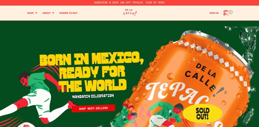
De La Calle is useful to study because the homepage quickly communicates the product positioning instead of overwhelming visitors with too many attributes at once. Shopify notes that De La Calle uses design to emphasize its value proposition and keeps secondary information lower on the page to reduce information overload.
What to study:
- The first screen makes the product easy to understand.
- Brand visuals match the product packaging.
- Secondary product benefits appear after the main message.
- Product details and shopping actions are not hidden too deep.
Best for:
- Food and beverage brands
- CPG brands
- Stores with strong packaging
- Stores that need to explain a new product category simply
Do not copy:
- The exact font or visual identity
- The product claims
- The brand positioning
Instead, copy the strategy: make the first message clear before adding supporting details.
2. Bite: Minimal Design With Product Education
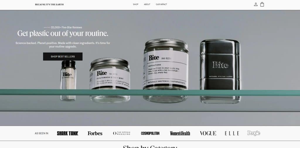
Bite is a strong example for stores selling a product that may need explanation. Shopify notes that Bite uses product photography to show how the product fits into customers’ lives and uses minimalist design to support both brand story and product education.
What to study:
- Product photography supports the brand positioning.
- The visual style matches the packaging.
- The site explains why the product format is different.
- Product images get strong space on the product page.
Best for:
- Beauty and personal care
- Wellness products
- Sustainable products
- Products that are not immediately familiar to shoppers
Do not copy:
- The minimalist style if your product needs more visual detail
- The sustainability messaging unless your brand can support it
- The layout without considering your product education needs
Instead, copy the strategy: use visuals and product copy to answer why the product is different.
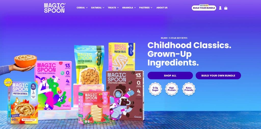
3. Magic Spoon: Bundle Experience and Social Proof
Magic Spoon is useful for brands that sell multiple flavors, variants, or bundles. Shopify notes that Magic Spoon uses playful visuals, customer feedback, review display, and a “Build Your Own Bundle” buying option. Shopify also describes how filters and tags were used to reduce decision fatigue on the bundle page.
What to study:
- The website turns product variety into a guided shopping experience.
- Review/social proof appears early.
- Bundle selection is treated as a key shopping flow.
- Filters and tags help shoppers choose faster.
- Stores with similar buying flows can study Shopify bundle apps when they want to help shoppers buy related products together.
Best for:
- Food and beverage stores
- Subscription products
- Multi-flavor products
- Bundle-heavy stores
- Stores trying to increase average order value
Do not copy:
- The review numbers unless they are true for your brand
- The exact bundle interface without testing your own customer behavior
- The playful design if it does not match your product category
Instead, copy the strategy: reduce decision fatigue when customers need to choose between many product options.
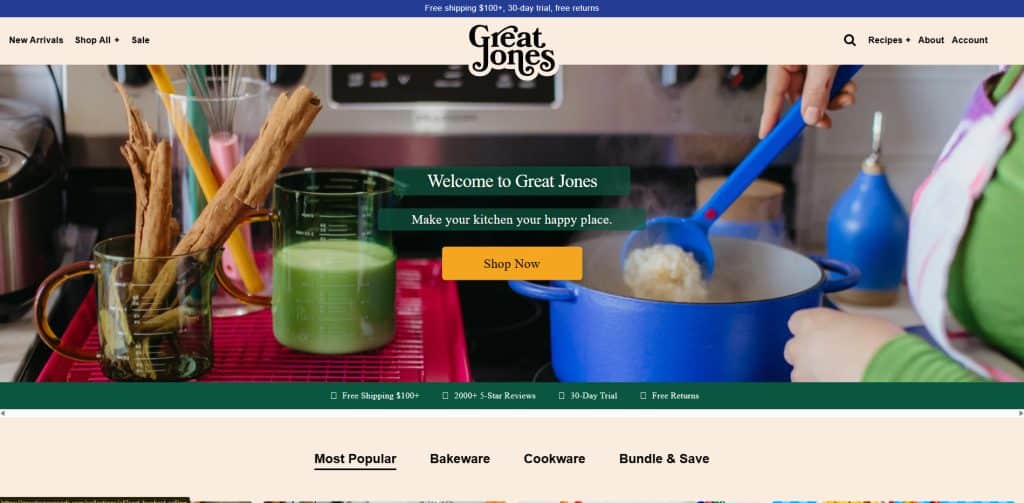
4. Great Jones: Navigation for a Larger Product Catalog
Great Jones is useful for stores with multiple categories. Shopify notes that Great Jones uses simple navigation and a sticky navigation bar with a mega menu to help customers find subcategories quickly.
What to study:
- The visual identity is consistent across the site.
- The mega menu helps shoppers move between product categories.
- The store does not rely only on homepage scrolling.
- Navigation supports browsing and discovery.
Best for:
- Home goods stores
- Kitchenware stores
- Fashion stores with many categories
- Stores with medium or large catalogs
Do not copy:
- A mega menu if your store has only a few products
- The retro visual style unless it fits your brand
- The exact category structure
Instead, copy the strategy: make it easy for shoppers to find the right category in one or two clicks.
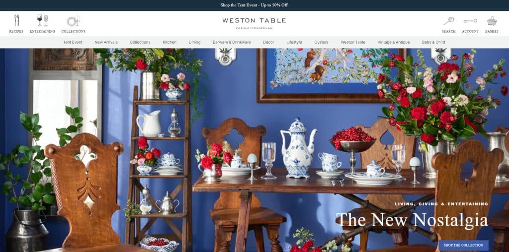
5. Weston Table: Editorial Content + Ecommerce
Weston Table is useful for content-led ecommerce. Shopify describes Weston Table as a blog-turned-online store with an editorial feel, lifestyle photography, split navigation, and ecommerce features such as registries and loyalty.
What to study:
- The site uses lifestyle photography instead of only plain product shots.
- Editorial content supports shopping inspiration.
- Navigation separates content and ecommerce.
- Product pages still need to be easy to buy from.
Best for:
- Home decor
- Lifestyle stores
- Gift shops
- Brands that sell through education, inspiration, or styling
Do not copy:
- Editorial-heavy design if your shoppers want fast product comparison
- Lifestyle photography without also providing clear product details
- Complex navigation for a simple store
Instead, copy the strategy: use content to help shoppers imagine how the product fits into their life.
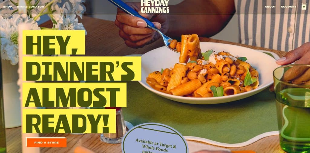
6. Heyday Canning Co.: Strong Brand Personality
Heyday Canning Co. is worth studying because it shows how visual identity can make a common product category feel more distinctive. Shopify notes that the site uses vibrant colors, unique fonts, and a retro feel.
What to study:
- Brand personality appears quickly.
- Visual style matches product packaging.
- The store uses color and typography to stand out.
- The product category feels more memorable.
Best for:
- Food brands
- CPG brands
- Giftable products
- Brands with bold packaging
Do not copy:
-
- Retro design only because it looks trendy
- Loud colors if your product needs a calm or premium feel
- Decorative fonts that reduce readability
Instead, copy the strategy: make your visual system match your product and category.
Visit store Heyday Canning Co.
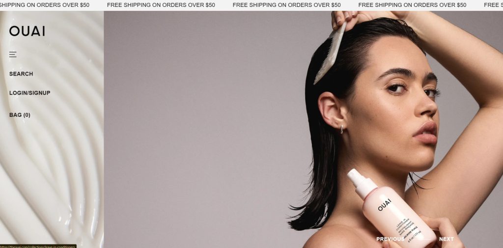
7. OUAI: Beauty Store With Product Education
OUAI is listed by Shopify as one of its Shopify website design examples. For beauty and wellness brands, the important lesson is to combine visual appeal with product education.
What to study:
- Clear product categories
- Clean product presentation
- Educational content around product use
- Simple navigation for shoppers who may not know what to choose
Best for:
- Haircare
- Skincare
- Beauty products
- Wellness products
Do not copy:
- Ingredient or benefit claims unless your brand has proof
- Product education that does not match your product
- A luxury tone if your brand is budget-friendly or playful
Instead, copy the strategy: help shoppers choose the right product for their concern, routine, or product type.
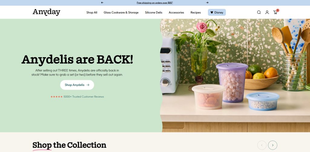
8. Anyday: Product Education for a New Buying Behavior
Anyday is also included in Shopify’s 2026 design examples. This type of store is useful to study when the product requires customers to understand a new routine, use case, or benefit before buying.
What to study:
- The product needs to be explained clearly.
- Use cases matter as much as product features.
- Product pages should answer practical questions.
- Visuals should show how the product is used.
Best for:
- Kitchen products
- Innovative home products
- New product categories
- Products that need how-to education
Do not copy:
- Educational claims without proof
- Product demonstrations that do not match your item
- Long explanations before the shopper understands the core benefit
Instead, copy the strategy: show how the product works before asking the shopper to buy.
How to Use Shopify Website Examples Without Copying
Studying examples is helpful only if you know what to look for.
Do not ask:
“How can I make my website look exactly like this?”
Ask:
“What customer problem is this design solving?”
Use this review table when studying Shopify websites:
| What to Study | Questions to Ask |
|---|---|
| Homepage | Can I understand what the store sells within 5 seconds? |
| Value proposition | Is the main promise clear, specific, and believable? |
| Navigation | Can shoppers find products without thinking too hard? |
| Product photos | Do images show the product clearly and in context? |
| Product page | Does the page answer objections before checkout? |
| Variants | Are sizes, colors, bundles, or options easy to choose? |
| Social proof | Are reviews, testimonials, UGC, or press used honestly? |
| Shipping and returns | Can shoppers find important policies before buying? |
| Mobile experience | Is the full journey easy on a phone? |
| App features | Do apps improve the journey or add clutter? |
| Brand voice | Does copy sound specific to the customer, or generic? |
Good Shopify website inspiration should help you make better decisions, not copy another brand’s identity.
What Good Shopify Websites Have in Common
Beautiful Shopify websites can look very different from each other.
A fashion store, beauty brand, coffee store, electronics shop, home decor store, and B2B store should not use the same layout. But strong Shopify websites usually share the same foundation.
1. Clear Homepage Message
A visitor should understand three things quickly:
- What you sell
- Who it is for
- Why it matters
A weak homepage says:
“Premium products for modern living.”
A stronger homepage says:
“Refillable skincare for sensitive skin.”
“Custom pet portraits delivered as framed wall art.”
“Reusable kitchen tools for low-waste homes.”
“Visual product options for Shopify fashion stores.”
The goal is not to sound fancy. The goal is to make the shopper feel oriented.
2. Simple Navigation
A Shopify website should not make shoppers guess where to click.
Good navigation usually includes:
- Shop
- Best Sellers
- New Arrivals
- Product categories
- About
- Contact
- Track Order or Help
- Search
- Cart
If your store has many products, add filters by size, color, price, use case, material, collection, or customer type.
If your store has only a few products, keep navigation simple and guide people toward the main product, bundle, or collection.
3. Strong Product Pages
The product page is where many purchase decisions happen.
A good Shopify product page should answer:
- What is this product?
- What problem does it solve?
- What is included?
- What options or variants are available?
- What size, color, material, flavor, or style should I choose?
- How much does it cost?
- When will it arrive?
- Can I return it?
- What do other customers say?
- Why should I buy from this store?
A product page should reduce uncertainty before checkout.
[Suggested image: Annotated Shopify product page showing product media, title, price, variants, CTA, review stars, shipping/return notes, and FAQ.]
4. Mobile-First Design
Many ecommerce shoppers browse from phones, so your Shopify website should be easy to use on mobile.
Check:
- Is the hero section readable on a phone?
- Are product images clear?
- Are buttons easy to tap?
- Is the menu simple?
- Is the cart easy to find?
- Do popups block the page?
- Are product options easy to select?
- Does checkout feel smooth?
- Are shipping and return details easy to find?
Shopify’s website builder page says Shopify’s online store editor is mobile-ready by default and designed responsively so stores can display across devices.
A Shopify website that looks good on desktop but feels crowded on mobile can lose shoppers before they reach checkout.
5. Trust Signals
New visitors do not automatically trust a store.
Add trust signals where they support the decision:
- Real customer reviews
- Product photos or videos
- Clear shipping policy
- Return and refund policy
- Contact information
- Brand story
- FAQ
- Ingredient, material, sizing, or usage details
- Before-and-after content, only when accurate and allowed
- Secure checkout and payment information
Shopify’s checkout documentation says customers use checkout to enter shipping information, payment details, place orders, and review store policies.
Do not fake reviews, fake awards, fake expert claims, fake sales numbers, or fake urgency. Trust only works when it is real.
6. Useful Apps, Not Too Many Apps
Shopify’s App Store includes categories such as sales channels, finding products, selling products, orders and shipping, store design, marketing and conversion, and store management. It also lists app categories such as product reviews, upsell and bundles, email marketing, SEO, shipping, currency and translation, and more.
Apps can improve a store, but too many apps can also make the store harder to manage.
Before installing an app, ask:
- Does this solve a real customer or business problem?
- Will it improve product discovery, trust, conversion, tracking, or retention?
- Is it compatible with my theme?
- Is the pricing clear?
- What permissions does it request?
- Does it slow down or clutter the store?
- Will we still need this app in 3 months?
Shopify’s app installation help page says merchants should review an app’s data access requirements and privacy policy before authorizing installation.
A small, focused app stack is usually better than installing every popular app.
Types of Shopify Websites You Can Build
Shopify websites can be simple or advanced depending on the business model.
| Website Type | Best For | Key Pages or Features |
|---|---|---|
| Single-product store | One hero product, gadget, creator product, or focused offer | Homepage, product page, reviews, FAQ, strong CTA |
| DTC brand store | Fashion, beauty, home, food, wellness, accessories | Homepage, collections, product pages, bundles, email capture |
| Niche catalog store | Stores with many SKUs in one niche | Search, filters, collection pages, comparison content |
| Custom product store | Personalized gifts, print-on-demand, engraving, file upload products | Product options, input fields, previews, clear instructions |
| Subscription store | Coffee, supplements, skincare, pet products, consumables | Subscription options, replenishment messaging, retention emails |
| B2B or wholesale store | Bulk buyers, retailers, distributors | Quote requests, hidden pricing, account access, volume rules |
| Content-led store | Brands that educate before selling | Blog, guides, product education, comparison pages |
| Local business ecommerce site | Retail shop, bakery, florist, restaurant merch | Local pickup, delivery info, contact, store location |
The best Shopify website structure depends on how customers buy.
A store selling low-cost stickers does not need the same level of product education as a store selling custom furniture. A beauty product may need ingredients and skin-type guidance. A fashion store may need size charts, swatches, and fit photos. A B2B store may need quote forms and order limits.
Shopify Website Features by Store Type
Fashion and Accessories Shopify Websites
Fashion shoppers often compare colors, sizes, styles, fit, and return policies.
Prioritize:
- High-quality product images
- Lifestyle photos
- Size guides
- Color swatches
- Product variants
- Fit notes
- Model photos
- Collection filters
- Return policy visibility
- “Complete the look” sections
If your products have multiple colors or patterns, visual swatches can make shopping easier than plain dropdowns.
Beauty and Wellness Shopify Websites
Beauty and wellness shoppers often need more education before buying.
Prioritize:
- Ingredients
- Product benefits
- Usage instructions
- Skin type, hair type, or concern
- Product routine guidance
- Reviews
- Subscription or bundle options
- FAQ
- Clear limitations
Be careful with claims. Do not make health, medical, or result-based claims unless your brand has reliable support.
Food and Beverage Shopify Websites
Food and beverage stores need to make products look appealing while also answering practical questions.
Prioritize:
- Flavor descriptions
- Ingredient information
- Nutrition or allergen details when relevant
- Bundle options
- Subscription options
- Shipping rules
- Storage instructions
- Reviews
- Strong photography
For multi-flavor products, filters, bundles, and “best seller” labels can help reduce choice overload.
Home and Lifestyle Shopify Websites
Home and lifestyle shoppers often need context.
Prioritize:
- Lifestyle photography
- Room or use-case examples
- Product dimensions
- Materials
- Care instructions
- Shipping details
- Gift guides
- Editorial content
- Collection pages by room, style, or use case
These stores often benefit from content that helps shoppers imagine how the product fits into daily life.
Custom Product Shopify Websites
Custom product stores need clarity.
Prioritize:
- Personalization fields
- File upload or text input
- Preview examples
- Production timeline
- Shipping expectations
- Custom order instructions
- Return policy limits
- Contact/support options
If your store sells personalized gifts, print-on-demand products, engraving, custom bundles, or made-to-order items, your product page should make Shopify product variants easy to choose and understand before checkout.
Custom products can create more buyer questions than standard products. The page should explain the process before checkout.
B2B or Wholesale Shopify Websites
B2B and wholesale shoppers usually care less about lifestyle branding and more about buying efficiency.
Prioritize:
- Quote request forms
- Bulk pricing information
- Minimum order quantity rules
- Account-based pricing if needed
- Product specifications
- Reorder workflow
- Contact page
- Lead capture
- Delivery and fulfillment details
A wholesale Shopify website does not always need to look like a DTC brand. It needs to make buying easier for business customers.
How to Build a Shopify Website Step by Step
Shopify’s website builder page outlines a basic creation flow: generate a site with AI or customize a theme, use the online store editor to customize sections, menus, and navigation, bring the brand to life with fonts, colors, images, videos, and animations, choose a name/logo/domain, add products or services, set up payments, and start selling.
Here is a practical version for Shopify merchants.
Step 1: Define the Purpose of the Website
Before choosing a theme, answer:
- Is this site mainly for selling products?
- Is it for generating leads?
- Is it for building a brand?
- Is it for selling subscriptions?
- Is it for wholesale or B2B?
- Is it for content and product education?
- Is it for a single product or a large catalog?
A store without a clear purpose usually becomes messy. Every page should support the main customer journey.
Step 2: Choose the Right Shopify Theme
Shopify themes give your store its design foundation.
The Shopify Theme Store includes free and paid themes, and Shopify says its themes are built to fit different kinds and sizes of businesses.
When choosing a theme, check:
- Does it fit your product type?
- Does it look good on mobile?
- Does it support the sections you need?
- Does it handle large catalogs if you have many products?
- Does it support strong product pages?
- Does it work with your required apps?
- Can you customize it without too much code?
- Does it support product media, size charts, swatches, FAQ, or blogs if you need them?
Do not choose a theme only because the demo looks beautiful. Choose it because it supports your actual store experience.
[Suggested screenshot: Shopify Theme Store page showing free/paid themes and filters.]
Step 3: Plan Your Main Pages
At minimum, most Shopify websites should have:
- Homepage
- Shop or All Products page
- Main collection pages
- Product pages
- About page
- Contact page
- FAQ
- Shipping policy
- Return/refund policy
- Privacy policy
- Terms of service
Depending on your store, you may also need:
- Size guide
- Track order page
- Reviews page
- Blog
- Gift guide
- Wholesale page
- Affiliate or influencer page
- Subscription page
- Store locator
- Product comparison page
- Product quiz
Step 4: Build Product Pages Around Buyer Questions
Product pages should not only describe the product. They should answer objections.
A useful structure:
- Product name
- Short benefit-led description
- High-quality images or video
- Variant selector
- Price
- Add to cart button
- Key benefits
- Product details
- How to use
- Size, ingredient, material, or technical information
- Shipping and returns
- Reviews
- FAQ
- Related products or bundles
If the product has multiple colors, styles, sizes, flavors, or materials, make those choices easy to understand.
Step 5: Add Apps Only Where They Improve the Buying Journey
Apps should support the customer journey, not distract from it.
Useful app categories for Shopify websites include:
- Product reviews
- Color swatches and variant options
- Bundles and volume discounts
- Upsells and cross-sells
- Email and SMS marketing
- Tracking pixels and conversion tracking
- Subscription tools
- Shipping and delivery tools
- Search and filters
- Page speed and image optimization
- Translation and currency tools
- Loyalty and referral tools
For example, Orichi’s Shopify app resources cover Shopify apps related to tracking pixels, bundles, TikTok/Facebook pixels, discounts, reviews, upsells, and other ecommerce workflows.
Before publishing, remove apps that do not serve a clear business or customer purpose.
Step 6: Make the Website Trustworthy
Trust should appear before checkout, not only during checkout.
Add:
- Real reviews
- Clear product photos
- Accurate product details
- Shipping timeline
- Return policy
- Contact method
- Secure checkout language, when accurate
- FAQ
- Brand story
- Social proof
- Clear pricing
Avoid:
- Fake urgency
- Fake reviews
- Hidden fees
- Confusing return policy
- Overpromising delivery speed
- Overclaiming product results
- Popups that block key information
Step 7: Test the Store Before Publishing
Before launching, test:
- Homepage on desktop and mobile
- Navigation
- Search
- Product filters
- Product variant selection
- Add to cart
- Discount code
- Shipping settings
- Tax settings
- Payment settings
- Checkout
- Order confirmation email
- Contact form
- Policy links
- Page speed
- Broken links
- App display on mobile
Place a test order if possible. A Shopify website can look ready but still have checkout, shipping, discount, or variant problems.
Shopify Website Checklist Before Launch
Use this checklist before publishing or redesigning your Shopify website.
| Area | Check |
|---|---|
| Brand clarity | Can visitors understand what you sell within 5 seconds? |
| Homepage | Does the homepage guide shoppers to products, collections, or the main offer? |
| Navigation | Are categories easy to find? |
| Product pages | Do product pages answer common buyer questions? |
| Product media | Are images clear, consistent, and mobile-friendly? |
| Variants | Are colors, sizes, styles, flavors, and options easy to choose? |
| Trust | Are reviews, policies, support, and contact information visible? |
| Checkout | Can shoppers complete a purchase without confusion? |
| Apps | Does each app serve a clear purpose? |
| Mobile | Does the full buying journey work on a phone? |
| SEO basics | Are title tags, meta descriptions, headings, and image alt text useful? |
| Speed | Are images optimized and unnecessary scripts removed? |
| Analytics | Are tracking and conversion events set up correctly? |
| Support | Can customers contact you if they have a problem? |
[Suggested image: Checklist graphic for Shopify website launch.]
Product Page Teardown: Weak vs Strong Shopify Page
A Shopify website can have a beautiful homepage and still lose shoppers on the product page.
Here is a simple product page teardown.
| Page Element | Weak Version | Stronger Version |
|---|---|---|
| Product title | “Premium Bottle” | “Insulated Stainless Steel Water Bottle – 24 oz” |
| Product description | “High quality and stylish” | Explains material, capacity, use case, cleaning, and who it is for |
| Images | One front photo | Front, side, close-up, lifestyle, size comparison, and mobile-friendly images |
| Variants | Dropdown with color names only | Visual color swatches or buttons with clear labels |
| CTA | Button appears after long text | Add to cart appears near price and variant selector |
| Shipping info | Hidden in footer | Short shipping estimate near purchase area, with full policy linked |
| Reviews | No review section | Real review section with date, rating, and review content |
| FAQ | Missing | Answers sizing, material, shipping, returns, and usage questions |
| Related products | Random products | Relevant accessories, bundles, or similar items |
The stronger version does not need to be longer. It needs to answer the right questions in the right place.
Common Shopify Website Mistakes
Mistake 1: Copying Another Store’s Design
A famous Shopify store may work because of its audience, product category, brand awareness, photography budget, paid traffic strategy, or long-term customer trust.
Copying the look does not copy the strategy.
Use examples for inspiration, then adapt the structure to your own customers.
Mistake 2: Using Too Many Apps Too Early
Apps can help, but too many apps can create design conflicts, slow down workflows, or make the store harder to manage.
Start with essentials. Add apps when there is a real business reason.
Mistake 3: Weak Product Descriptions
Many Shopify stores only list product specs.
Better product descriptions explain:
- What the product does
- Who it is for
- Why it is useful
- How to choose the right option
- What to expect after buying
Mistake 4: Hiding Shipping and Returns
If shoppers cannot find shipping and return information, they may hesitate.
Put key details near product pages, cart, FAQ, and footer.
Mistake 5: Making Variant Selection Hard
If a product has many colors, sizes, styles, flavors, or materials, the store should make those choices visual and simple.
For stores that sell fashion, beauty, home decor, accessories, or custom products, color swatches and variant options can make product selection clearer than plain dropdown menus.
A shopper should not need to guess what “Blue 02,” “Pattern A,” or “Variant 3” means. Visual options help customers compare choices faster and reduce confusion before checkout.
Mistake 6: Designing Only for Desktop
Many merchants build their store on a laptop and forget to test the buying journey on a phone.
Always test the mobile version before publishing.
Mistake 7: Weak About and Contact Pages
For new stores, trust matters.
A simple About page and clear Contact page can make the store feel more real. Add who you are, what you sell, where customers can get help, and what makes your product different.
Mistake 8: Adding Visual Design Without Fixing the Buying Journey
A redesign should not only make the website look newer.
A useful redesign should make it easier to:
- Find products
- Understand the offer
- Compare options
- Trust the store
- Add to cart
- Complete checkout
- Get help after purchase
Good design supports shopping decisions.
When Should You Redesign a Shopify Website?
You may need to redesign your Shopify website if:
- Visitors browse but do not add to cart
- Product pages get traffic but few purchases
- Customers ask the same questions repeatedly
- Mobile conversion is weak
- The site looks outdated compared with your product quality
- Navigation is confusing
- Your theme no longer supports your needs
- App conflicts create display problems
- You are adding wholesale, subscriptions, bundles, or international selling
- Your brand positioning has changed
If your store has Shopify traffic but no sales, do not redesign only for visual style. First, check whether shoppers understand the product, trust the store, find shipping and return information, choose variants easily, and complete checkout without friction.
Do not redesign only because you are bored with the design.
Redesign when the current website no longer supports how customers shop or how the business sells.
Best Shopify Website Structure for New Stores
If you are starting from scratch, keep the first version simple.
Recommended structure:
- Homepage
- Shop or All Products
- Main collection pages
- Product pages
- About page
- Contact page
- FAQ
- Shipping policy
- Returns/refund policy
- Privacy and terms pages
After the store gets traffic and orders, improve based on real behavior:
- Add reviews if customers need social proof
- Add swatches if variants are important
- Add bundles if customers buy related products together
- Add content if shoppers need education
- Add email capture if visitors are not ready to buy
- Add tracking improvements if ad performance is unclear
- Add upsells if average order value is low
- Add filters if shoppers have too many choices
- Add comparison content if buyers need help choosing
Build the website around actual customer behavior, not assumptions.
Shopify Website SEO Basics
A Shopify website also needs basic SEO work so shoppers and search engines can understand the page.
Start with:
- Clear title tags
- Helpful meta descriptions
- One clear H1 per page
- Descriptive H2/H3 headings
- Product names that match how customers search
- Unique product descriptions
- Image alt text that describes the product
- Internal links between related products, collections, and guides
- Fast-loading images
- Helpful FAQ sections
- Clean navigation
Shopify’s website builder page says Shopify includes integrated SEO controls and can generate title tags, meta descriptions, and a sitemap.
Still, do not rely only on default settings. Review important pages manually before publishing.
Shopify Website App Stack: What to Add First
A new Shopify store does not need a huge app stack.
Start with apps that solve real problems.
| Store Need | App Type to Consider | Why It Helps |
|---|---|---|
| Need social proof | Product review app | Shows real customer feedback |
| Many variants | Swatch or product options app | Makes color, size, style, or custom options easier to choose |
| Low average order value | Bundle or volume discount app | Helps shoppers buy related products together |
| Paid ads | Pixel/tracking app | Helps track product views, add-to-cart actions, purchases, and campaign performance |
| Repeat purchases | Email/SMS or loyalty app | Helps bring shoppers back |
| Subscription products | Subscription app | Supports recurring purchases |
| Large catalog | Search/filter app | Helps shoppers find products faster |
| International shoppers | Translation/currency app | Helps localize the store experience |
Before installing an app, review the app listing, pricing, data permissions, privacy policy, recent reviews, and support options.
Conclusion
A strong Shopify website is not only about design.
The best Shopify websites combine clear branding, easy navigation, useful product pages, mobile-friendly layouts, trust signals, smooth checkout, helpful content, and the right apps for the store’s business model.
Use Shopify website examples for inspiration, but do not copy them blindly. Study how they guide shoppers, explain products, build trust, and reduce friction.
Start with a clear purpose, choose a theme that fits your product type, build the pages your customers need, test the full buying journey, and add apps only when they solve a real problem.
For Shopify merchants, the goal is simple: make it easy for the right customer to understand your product, trust your store, and complete the purchase.
FAQ
What is a Shopify website?
A Shopify website is a website built on Shopify’s ecommerce platform. It can be used to sell products, services, digital goods, subscriptions, custom products, or branded merchandise.
Can I build a Shopify website without coding?
Yes. Shopify’s website builder includes no-code editing tools, customizable themes, drag-and-drop sections, theme settings, and AI-powered features. Shopify also allows deeper customization with CSS or Liquid for advanced users.
What should every Shopify website include?
Every Shopify website should include a homepage, product pages, collection pages, cart, checkout, About page, Contact page, FAQ, shipping policy, return/refund policy, privacy policy, and terms page. Stores with complex products may also need size guides, product education, reviews, custom options, or quote forms.
What makes a Shopify website good?
A good Shopify website is clear, easy to browse, mobile-friendly, trustworthy, and built around the customer’s buying journey. It should have useful product information, strong visuals, simple navigation, visible policies, and a smooth checkout experience.
Where can I find Shopify website examples?
You can study Shopify’s curated website design and store example guides. Shopify’s 2026 design list includes examples such as De La Calle, Bite, Magic Spoon, Great Jones, Weston Table, Heyday Canning Co., Ghia, FreshCap, OUAI, and Anyday.
Should I use a free or paid Shopify theme?
A free Shopify theme can be enough for a new or simple store. A paid theme may be useful if you need more built-in sections, stronger merchandising layouts, advanced filtering, or a more polished design. Choose based on your product type, catalog size, mobile experience, and app compatibility.
How many apps should a Shopify website use?
There is no perfect number. Use only the apps that solve a clear problem, such as reviews, swatches, bundles, tracking, upsells, subscriptions, shipping, search, loyalty, or email marketing. Too many apps can make the store harder to manage.
How do I improve my Shopify product pages?
Improve product pages by adding clear photos, benefit-led descriptions, visual variant selectors, reviews, shipping information, return details, FAQs, product specifications, and related products or bundles. The goal is to answer buyer questions before they leave the page.
Are Shopify websites good for SEO?
Shopify websites can support SEO through title tags, meta descriptions, sitemap generation, blogging, custom domains, and editable page content. However, merchants still need helpful page content, clear structure, optimized images, internal links, and unique product descriptions.
What is the biggest mistake new Shopify stores make?
One of the biggest mistakes is focusing on visual design before fixing the buying journey. A Shopify website should first make it easy for shoppers to understand the product, trust the store, choose the right option, and complete checkout.