Shopify Getting Traffic but No Sales is frustrating—because it feels like you’re doing the hard part already You’re getting visitors to your Shopify store, but orders are stuck at zero (or close to it). That’s frustrating—because it feels like you’re doing the hard part already. The good news: most “traffic but no sales” problems are conversion bottlenecks, not traffic problems. In this guide, you’ll quickly pinpoint where shoppers drop off, then apply a priority fix plan to turn visits into purchases.
Key Takeaways
Below are the fastest root causes of Shopify Getting Traffic but No Sales, and what to fix first. If your Shopify store is getting traffic but no sales, it usually comes down to one (or more) of these 5 root causes:
- Wrong intent: You’re attracting “window shoppers” who browse but aren’t ready to buy.
- Weak product page (PDP): The value isn’t clear, social proof is missing, or the photos/copy don’t convince.
- Unexpected extra costs: Shipping/taxes show up late and create sticker shock at the cart or checkout.
- Checkout friction: Limited payment options, a confusing form, or technical errors stop people from completing the purchase.
- Low trust: New store, unclear policies, or not enough credibility signals.
Fastest way to fix it: Identify where people drop off in your funnel (product page → cart → checkout) and tackle the P0 issues first—the changes with the biggest impact.
Simple expected revenue formula
To understand why Shopify Getting Traffic but No Sales happens, start with this simple revenue formula:
Revenue ≈ Sessions × CVR × AOV
- Sessions = visits
- CVR = purchase conversion rate
- AOV = average order value
Example: 10,000 sessions/month × 1% CVR × $25 AOV ≈ $2,500/month.
If you have 10,000 sessions but a 0.2% CVR, you don’t need more traffic. You need a better purchase path.
Shopify Getting Traffic but No Sales: Quick Diagnosis Table
| Symptom | Likely cause | How to confirm | Fast fix |
|---|---|---|---|
| High bounce, low time on page | Intent mismatch / weak first screen | Check top traffic source + landing page | Rewrite headline + match offer to intent |
| Many product views, low Add to Cart | Weak product page (PDP) | Add-to-cart rate (ATC) | Improve images, benefits, trust, shipping clarity |
| Good ATC, low checkout start | Cart friction / hidden costs | Initiate Checkout rate | Show shipping earlier + simplify cart |
| High checkout abandonment | Fees, payments, form friction, errors | Abandoned checkout rate + test order | Reduce steps, add payments, fix UX bugs |
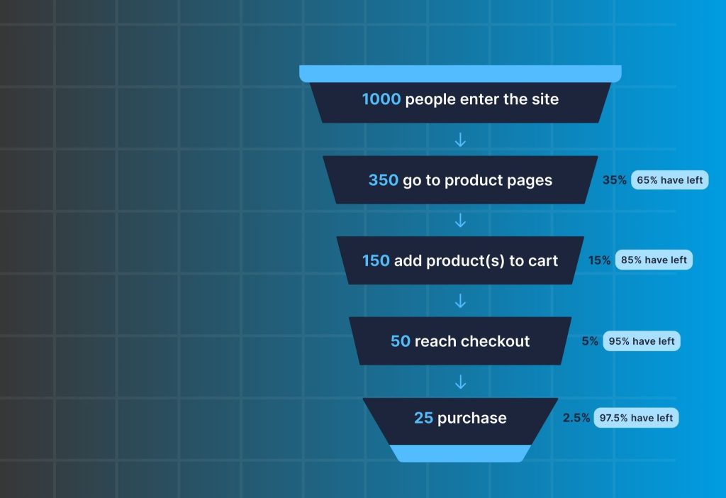
Find Your Drop-Off Point (Product Page → Cart → Checkout)
If you’re stuck with Shopify Getting Traffic but No Sales, your job is to find the single biggest leak in the funnel. You don’t need to guess. You need to identify the single biggest leak in your funnel. Once you know the leak, fixes become obvious.
- Where does your traffic come from most? (Ads / SEO / Social / Influencers)
- Do people add to cart? If ATC is almost zero → your issue is landing page or product page
- Do people start checkout? If ATC is okay but checkout is low → your issue is cart clarity, costs, or trust
- Do people reach checkout but not buy? If checkout abandonment is high → your issue is fees, payment options, form friction, or errors
Pro tip: If you’re not tracking Add to Cart / Checkout / Purchase reliably, set that up now. Without funnel events, you’ll waste time “optimizing” the wrong thing.
Module 1: Fix the Product Page (PDP)
In many cases of Shopify Getting Traffic but No Sales, the product page (PDP) is the first bottleneck. Most “no sales” stores fail on the product page because the shopper still feels uncertain. This module improves clarity first, then trust, then friction. That order matters.
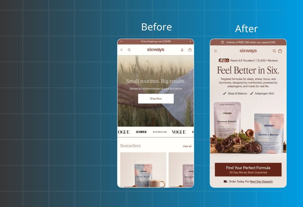
Message–Intent Mismatch
If you’re getting visitors but zero sales, start by checking intent match. People click because your ad, keyword, or influencer post makes a specific promise. If they land on your product page and don’t immediately see that promise fulfilled, they leave—often within seconds. This is one of the most common reasons new stores “feel busy” but don’t convert, even when the product is solid.
What to check
| Step | What to do | What you’re looking for | If it’s missing, it means… |
|---|---|---|---|
| 1) Pick ONE main traffic source | Choose the source driving the most sessions (one ad creative OR one SEO keyword) | A single “promise” people are clicking for | You’re testing too many things at once, so you can’t diagnose the real mismatch |
| 2) Write the click reason in 1 sentence | Finish this: “They clicked because they want ___.” (e.g., reduce back pain, save time, safe for sensitive skin, best value bundle, perfect color/size) | A clear expectation in plain words | If you can’t explain the click reason, your messaging is likely unclear or too broad |
| 3) Do the 5-second first-screen test | Open the PDP and look ONLY at above-the-fold (first screen). Give yourself 5 seconds. | A cold visitor should instantly “get it” | If it takes longer than 5 seconds, you’re likely losing them before they scroll |
| 4) Question #1: Problem match | Ask: “Does this solve the exact thing I clicked for?” | The same promise appears clearly (benefit/outcome) | If not, you have an intent mismatch (wrong headline/angle) |
| 5) Question #2: Trust | Ask: “Do I believe this is real?” | Quick proof (review line, UGC snippet, before/after, credibility cue) | If not, visitors bounce because it feels risky or untrusted |
| 6) Question #3: Buying clarity | Ask: “Do I know what to do next—and what it will cost?” | Clear CTA + key costs/commitments (shipping/returns basics) | If not, people hesitate because checkout feels uncertain |
How to fix it
1) Mirror the promise in your headline—don’t make people guess.
Use the same language as the ad/keyword (the benefit/outcome), not just the product name.
If the ad says “relieves back pain while sitting,” your first line should reinforce that exact idea immediately.
2) Build the first screen using a simple conversion structure: Benefit → Proof → CTA.
A high-performing above-the-fold section is usually just three parts:
- Benefit: the outcome they want (clear, specific)
- Proof: why they should believe you (short, not salesy)
- CTA: a clean “Add to cart / Buy now” path with low friction
Proof doesn’t need to be long. One or two authentic review lines, a short UGC snippet, a compact “before/after,” or a small credibility cue is often enough to stop the bounce.
3) If your traffic comes from social, bring the same social proof onto the PDP.
Social visitors are used to judging trust through real content. Embedding Instagram/TikTok/UGC directly on the product page helps the landing experience feel consistent with what they just saw before clicking (a common approach is using an IG feed-style block, like an Instafeed implementation).
4) If you have Trustpilot (or need trust quickly), display it cleanly—not aggressively.
Importing and showing Trustpilot reviews in a simple carousel/grid layout can add credibility without clutter (a “Trust.io – Trustpilot Reviews” style setup). Place it near the buy area, not buried at the bottom.
5) If people hesitate on “is it worth it?”, make the choice easier instead of discounting harder.
For brand-new stores, heavy discounting can reduce trust. A safer move is to provide a clear “starter choice”:
- a starter kit,
- a bundle, or
- a volume deal (bundle/volume discount logic)
This reduces decision fatigue because shoppers don’t have to calculate what to buy.
6) If you have many variants, reduce selection friction.
When shoppers struggle to choose color/variant, they pause and drop. Converting variants into visual swatches (a Swatchify-style approach) often improves speed-to-choice with minimal copy changes.
7) Measure correctly before you optimize.
If you’re running ads but your events are missing or inaccurate (Add to Cart / Initiate Checkout / Purchase), you’ll “fix the wrong thing.” Clean tracking (pixel or multi-pixel), server-side signals (CAPI), and consistent UTM attribution gives you the visibility to pinpoint where the drop-off actually happens—similar to how OC Meta Pixel-style setups are used to validate funnel events.
The offer feels weak
When you have zero sales, “too expensive” is rarely the real problem. Most of the time, shoppers simply don’t see enough value + enough safety to say yes today.
What to check
| Check | What to look at (on the buy area) | A “good” sign looks like… | If it’s fuzzy, it usually means… |
|---|---|---|---|
| 1) What do I get? | Title + variant/size + what’s included (bundle/kit, quantity, accessories) | Clear “what’s in the box” in 1–2 lines | Shoppers aren’t sure what they’re paying for → they pause or leave |
| 2) Why is it worth this price? | Benefit + key differentiator + proof near the price/CTA | One clear outcome + one short proof cue (review line/UGC/metric) | Value is unclear → price feels “too expensive” even if it’s fair |
| 3) What happens if it doesn’t work? | Returns/exchange/warranty/support info near the CTA | Simple risk-reducer: “30-day returns” / “easy exchanges” / “warranty” | Risk feels high → people won’t be the first buyer on a new store |
If any of these three answers isn’t obvious in the buy area, the price will feel risky—especially for a new store with no sales yet.
How to fix it
1) Add a “starter choice” so buying feels easier.
New stores lose sales because shoppers don’t want to do math or make decisions. Give them a clear option like:
- Starter kit / bundle (best for new customers)
- Buy 2–3 and save (volume deal)
A simple bundle/volume setup is exactly how many stores increase “worth it” without aggressive discounting.
2) Make shipping cost expectations visible early.
Hidden shipping is one of the fastest trust killers. Even if you can’t offer free shipping, make the threshold/expectation obvious so shoppers don’t fear surprise fees later.
3) If your price is higher, don’t explain—frame value in one line.
Use a short comparison that makes the premium feel logical:
- “Lasts 3× longer than typical options.”
- “Saves 10 minutes per use.”
- “Results in 7 days (based on customer feedback).”
Keep it tight. One line near the price often beats a long paragraph.
Product photos and copy don’t help people imagine using it
Your product page must answer the shopper’s silent question: “Will this work for me?”
If they can’t picture it, they won’t buy—no matter how good the product is.
How to fix it
1) Build a “visual story” with 6–9 images.
Aim for:
- Close-up detail
- Size/scale
- In-context use
- Before/after (if applicable)
- How it’s used (step-by-step)
- What’s included in the box
2) Add short real-life content (UGC/video) to reduce doubt.
For social-heavy traffic, embedding Instagram/TikTok/UGC on the PDP makes the experience feel consistent with what they clicked from (often done with an IG feed-style block).
(If you prefer “product-page video” guidance first, this is helpful.)
3) Use a copy structure that answers questions in order.
Problem → Solution → Benefits → Specs → Quick Q&A
Keep each section short. New stores convert better when the page is easy to scan.
Module 2: Fix Cart & Checkout Leaks
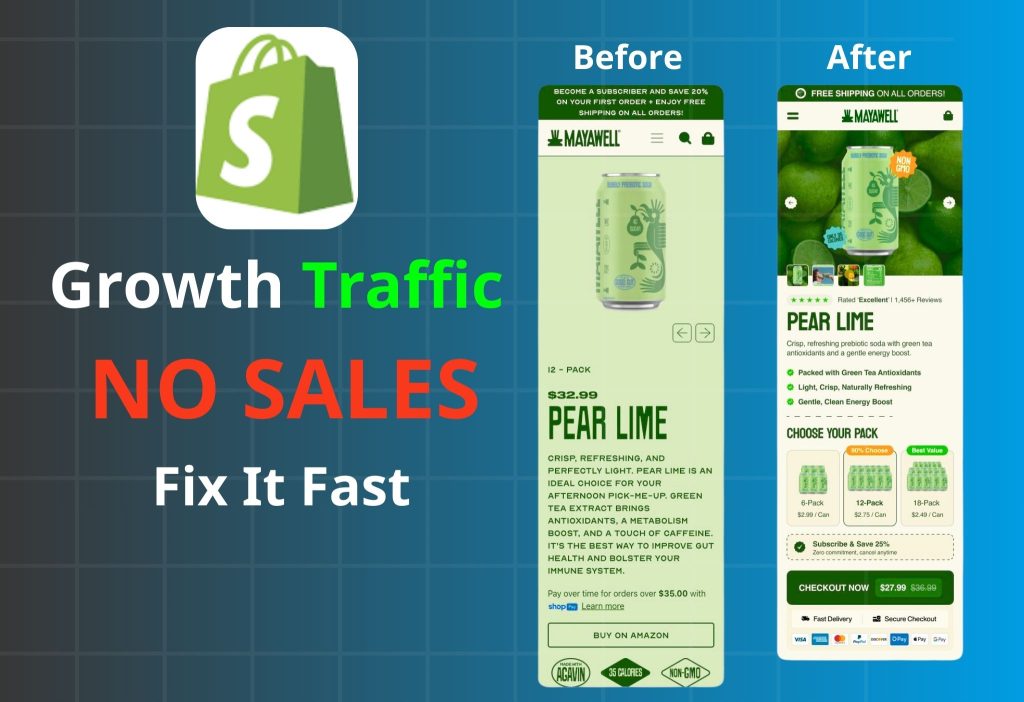
If you have Add to Cart but still Shopify Getting Traffic but No Sales, checkout friction or surprise fees are usually the culprit. If someone adds to cart, they’re interested. Losing them after that is usually a surprise cost, a payment mismatch, or checkout friction. This module reduces abandonment quickly.
Shipping/fees surprise
If you’re seeing Add to Cart but still zero sales, check for sticker shock next. People add to cart because the product feels right at the listed price. If they reach cart or checkout and the total jumps because shipping, taxes, or extra fees appear late, trust drops fast. This is one of the most common reasons new stores get “almost buyers” but no completed orders—especially on mobile.
What to check
| Where to look | What you’ll see | What it likely means |
|---|---|---|
| Analytics (cart → checkout) | Add to Cart is OK, but Initiate Checkout is low | People add to cart, then stop when the total changes (shipping/taxes feel unexpected) |
| Analytics (inside checkout) | Checkout abandonment is high, especially after address/shipping step | Shipping/taxes show up too late and create sticker shock |
| Step events (if you track them) | Big drop at Cart → Checkout or Shipping / Taxes step | The leak is specifically tied to shipping cost visibility or clarity |
| Mobile test order | Shipping/taxes appear only after entering address or at the final step | Costs are revealed late, so shoppers feel “surprised” |
| Product page (above the fold) | No clear note about delivery time, shipping estimate, free shipping over $X, or regions | Shoppers can’t predict the final cost before adding to cart |
| Cart page copy | Subtotal is shown, but it’s unclear if it’s before shipping/taxes | The final total feels confusing or misleading |
| Customer messages | Questions like “Why is shipping so high?” / “Do you offer free shipping?” | Shipping expectations aren’t being set early enough |
How to fix it
Set cost expectations early (PDP + cart).
Don’t try to hide costs. Make them predictable.
- Near the Buy/Add to Cart button, add one short line such as:
- “Estimated delivery: 2–4 days”
- “Shipping calculated at checkout”
- or “Free shipping over $X”
- Repeat the same message in cart so it stays consistent before checkout.
Rule: Before checkout, the shopper should know at least one of these: free shipping threshold, shipping estimate, or shipping is calculated at checkout.
If you offer free shipping, make the threshold obvious (and show progress)
Free shipping works best when shoppers can “see the path.”
- Use one clear line: “Free shipping over $49”
- In cart, show progress: “You’re $12 away from free shipping”
A common implementation is a free shipping bar shown on PDP/cart to prevent last-minute surprise (similar to the lightweight bar approach referenced here):
Clarify totals so the price doesn’t feel “wrong”
If taxes/fees are required, the problem is usually wording and layout.
Use clear labels like:
- “Subtotal (before shipping & taxes)”
- “Taxes calculated at checkout”
This prevents shoppers from feeling like the store changed the price.
Localize the promise by region (avoid vague claims)
New stores often lose trust by over-promising.
- If free shipping is limited: “Free shipping over $49 (US only)” or “(selected regions)”
- If delivery time varies: “2–4 days (domestic)” and note international timelines separately.
Re-test and measure the impact (3–7 days)
After changes:
- Re-run the mobile test order: no step should feel like a surprise.
- Track:
- Initiate Checkout rate
- Checkout abandonment rate
- Purchase conversion rate
When sticker shock is fixed, you’ll usually see cart → checkout improve first, then completed purchases follow.
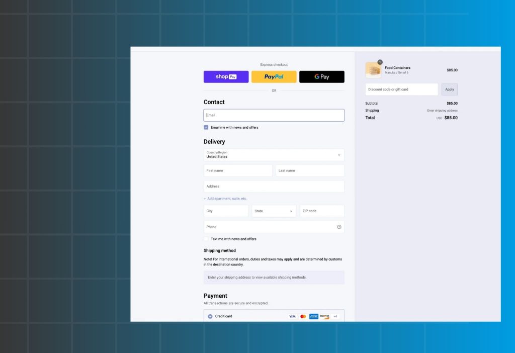
Checkout
What to check
| What to check | Where to look | What you’ll notice | What it likely means |
|---|---|---|---|
| Guest checkout | Checkout settings + checkout page | Shoppers must create an account before paying | Forced account creation adds friction and kills first-time purchases |
| Number of fields | Address + contact forms (mobile) | Too many inputs (company, address line 2, notes, etc.) | Every extra field increases drop-off, especially on mobile |
| Steps / page flow | Cart → checkout path | Multiple screens, repeated info, too many clicks | Checkout feels “long,” users get tired or distracted |
| Distractions during checkout | Header/menu, popups, banners, upsells | Navigation menus, promo banners, upsell blocks inside checkout | People lose focus and abandon or go “browse” instead of paying |
| Where people drop | Shopify Analytics / GA4 / pixel events | High drop at Begin Checkout or during shipping/payment step | Checkout UX is the bottleneck (not the product) |
| Mobile friction | Test checkout on a phone | Keyboard covers fields, errors are hard to fix, slow loading | Mobile UX issues magnify abandonment |
How to fix it:
Remove the biggest friction first: allow guest checkout
If someone is buying for the first time, asking them to create an account feels like “work.”
- Enable Guest Checkout (no account required).
- If you still want accounts, offer it after purchase (“Create password to track your order”).
Why this works: it reduces decision fatigue and keeps the buyer in “pay now” mode.
Cut form fields like a surgeon (keep only what shipping needs)
On mobile, every field is a chance to quit. Start simple:
- Remove optional fields (Company, Address line 2, Order note, etc.) unless you truly need them.
- Keep the essentials: Email/Phone, Name, Address, City, Country, Shipping method, Payment.
- Avoid asking for “extra” info before payment (birthday, survey questions, etc.).
Quick rule: If a field doesn’t help deliver the order or take payment, it shouldn’t be required.
Make checkout a straight line
Checkout should feel like a tunnel: cart → pay → confirmation.
- Remove or minimize header menus and “continue shopping” distractions.
- Avoid popups or banners that pull attention away from payment.
- If you run upsells, don’t push them inside checkout. Move them after purchase instead.
A clean way to keep upsell revenue without adding checkout friction is post-purchase upsell (shown on thank-you / post-checkout flow). This is exactly the use case for tools like:
If COD is common for your audience, use a shorter COD-first flow
In some markets, COD buyers abandon standard checkout because it feels too long or “too online.”
A dedicated COD form can reduce steps and improve completion (especially on mobile).
Best practice: keep the COD form minimal (name, phone, address) and confirm clearly.
Validate with one simple test
After changes:
- Do a full test order on mobile from product page → cart → checkout.
- Track these metrics for 3–7 days:
- Initiate Checkout rate
- Checkout abandonment rate
- Purchase conversion rate
Expected early win: Initiate Checkout rises first, then abandonment drops, then purchases follow.
Discount code box makes people leave to “hunt coupons”
When shoppers see a discount code box, many assume they’re supposed to have a code. They pause, open a new tab, and start searching. That break in momentum is deadly for new stores—most people don’t come back. This isn’t about “needing bigger discounts.” It’s about removing a checkout distraction that creates doubt.
What to check
| What to check | Where to look | What you’ll notice | What it likely means |
|---|---|---|---|
| Drop-off at payment step | Shopify Analytics / GA4 funnel | Checkout starts happen, but abandonment spikes near payment | The code box is triggering hesitation or tab-switching |
| Time stalls in checkout | Session recordings / heatmaps (if available) | Users stop scrolling near “Discount code” | They’re thinking “I should find a coupon” |
| Customer messages | Inbox/comments | “Do you have a discount code?” “Any coupon?” | The code field is training people to expect a discount |
| Checkout UI emphasis | Checkout page | Code box is visually strong (big, near total, looks required) | People feel they’re missing a better price |
| Your actual promo behavior | Your marketing calendar | You rarely run coupons, but the field is always there | You’re adding friction without getting benefit |
| Mobile behavior | Mobile checkout test | The code area interrupts flow, pushes totals down | Extra scrolling + distraction increases abandonment |
How to fix it
1) Replace coupon hunting with automatic discounts
If you run promos, the simplest way to stop “coupon hunting” is to remove the need for codes.
- Use automatic discounts (applied at checkout without typing anything).
- If you need targeting, apply rules like: minimum order value, specific products, first-time buyer, etc.
- Show the discount as already applied so shoppers feel relief, not doubt.
Why it works: it keeps checkout momentum. People don’t leave the page to “search for the missing code.”
2) If you don’t run coupons, don’t let the code box look important
Even when you can’t remove the field (depending on checkout setup), you can reduce the damage:
- Avoid making it prominent near the total or CTA.
- Don’t mention “Discounts” heavily in cart/checkout copy unless a discount is actually active.
- If you never offer codes, don’t add banners like “Use code…” or “Promo available” that make people feel they’re missing out.
Goal: the buyer should feel “pay and finish,” not “wait, I need to find something first.”
3) Set expectations early (so the checkout doesn’t surprise them)
If you do run occasional codes:
- Show the code earlier (cart or PDP) so shoppers don’t go searching.
- Keep it simple: one code, one benefit, clear expiry.
If you don’t run codes:
- Don’t tease discounts in your messaging.
- Focus on value and risk reducers (shipping clarity, easy returns) instead.
4) Use offers that don’t require typing (cleaner than coupons)
For new stores, heavy couponing can reduce trust (“why is it discounted so hard?”). Cleaner alternatives:
- Free shipping threshold (clear, predictable)
- Bundle / starter kit / volume deal (value-based, not “cheap”)
These improve conversion without training shoppers to hunt coupons.
If you want a bundle/volume pattern reference that doesn’t rely on coupon codes:
5) Validate the fix with one simple metric check
After switching to automatic discounts or reducing code emphasis, watch for 3–7 days:
- Checkout abandonment rate (should drop)
- Purchase conversion rate (should rise)
- Time spent in checkout (should shorten, fewer stalls)
Rule (use this as a quick decision filter)
If a field doesn’t help deliver the order or take payment, it shouldn’t be required.
The discount code box doesn’t help delivery or payment—so it should never become a “step” in your buyer’s mind.
Module 3: You’re Getting the Wrong Traffic
Sometimes Shopify Getting Traffic but No Sales isn’t a store issue—it’s a traffic quality issue. Not all traffic is equal. 1,000 highly-intent visitors can outperform 10,000 casual scrollers. This module helps you match channel → message → landing page.
If your traffic is mostly SEO
SEO can bring informational visitors who aren’t ready to buy.
Fix fast:
- Map each blog post to a relevant product/collection CTA
- Add a short “Who it’s for / who it’s not for” section to qualify buyers
If your traffic is mostly Ads
Ads fail when the promise and the landing page don’t line up.
Fix fast:
- Match headline, visuals, and offer between ad and landing page
- Split ad groups by pain point instead of sending everyone to one generic page
If your traffic is mostly Social / Influencers
Social traffic often has curiosity, but low trust.
Fix fast:
- Put UGC and testimonials front-and-center on PDP
- Create a simple “starter pack” landing page for first-time buyers
Shopify Getting Traffic but No Sales 90-minute conversion checklist
If you feel overwhelmed, follow this order. It’s designed to increase conversion rate first—because scaling traffic on a leaky store just burns budget faster.
| Priority | What to do | Impact | Time |
|---|---|---|---|
| P0 | Show shipping/returns clearly near the buy button | Very high | 15–30 min |
| P0 | Rewrite above-the-fold PDP: headline, benefits, CTA | Very high | 20–40 min |
| P1 | Add reviews/UGC + trust cues (clean and simple) | High | 30–60 min |
| P1 | Reduce checkout friction + enable guest checkout | High | 20–45 min |
| P2 | Add bundles/threshold offers (free ship over X) | Med–High | 60–120 min |
FAQ
What’s a “good” Shopify conversion rate?
It varies by niche and price. If you’re below ~0.5% with decent traffic, you likely have a clarity/trust/checkout problem worth fixing first.
Does “no sales” mean my product is bad?
Not necessarily. Many stores have good products but weak messaging, unclear value, missing trust, or surprise fees.
Should I fix the store or run more ads?
Fix the store first. More traffic won’t help if your funnel is leaking. It will just amplify the leak.
Will discounts solve it?
Discounts can boost short-term sales, but the stronger long-term win is clearer value + lower perceived risk (returns, trust, shipping clarity).
Should I change my theme?
A theme is a container. If your offer and trust are weak, a new theme won’t save conversions.
Wrap-up
If you’re dealing with Shopify Getting Traffic but No Sales, focus on where shoppers drop off and fix the P0 issues first. Start with the fastest wins: make costs clear, strengthen the first screen of your product page, add trust (reviews/UGC), and remove checkout friction. Do those, and your conversion rate usually moves—often faster than you expect.